Saturday, July 31, 2010

Let the Right One In: Swedish vampires and their American imitators

With the connotations the term "vampire movie" has garnered the past couple years, I wouldn't say I'm a fan of vampire flicks at all. But 2008's Let the Right One In is a breed apart. It's a beautifully shot, stark film based on a 2004 novel by the same name about kids growing up in a snowy town in the early '80s. Låt den rätte komma in, as it's known in Sweden, was a surprise hit outside of its home country, and won a ton of awards all over the world for a relatively unknown director named Tomas Alfredson.

Only two years later, a U.S. remake is in the works, and fans of the original film are crying foul. Americans are dumb and don't want to read subtitles! They're totally ignorant of the rest of the world! They don't appreciate good cinema! The makers of the upcoming American version, known simply as Let Me In, say it's based on John Ajvide Lindqvist's novel and not the first film adaptation, which means it will be different from Let the Right One In. But the first trailer for the remake has been released, and it seems eerily similar to the original Swedish film. Even the actor who plays the main character looks so much like his Swedish counterpart (albeit with brown hair instead of blonde), it's uncanny. Let's take a gander. Here's the trailer for the original Swedish masterpiece:


Now here's the trailer for the upcoming American Let Me In, set to be released October 1st of this year:


Pretty similar, eh? Some are even calling it a "shot-for-shot remake." But before we jump to all these conclusions, let's get some perspective. American remakes of foreign-language films that were released only a few years before isn't uncommon, and it isn't always a bad thing. Martin Scorsese's 2006 film The Departed is often cited as one of the greatest movies of all time, and it's a remake of a Hong Kong flick from only four years earlier called Infernal Affairs.

So although I'll be a huge skeptic, I'm sure I will go see Let Me In as soon as it hits theaters in October. After all, it is directed by Matt Reeves, the man at the helm of Cloverfield. A lot of people weren't a fan of the handheld monster mash, but it's one of my favorites. Even if it's not as good as the original (and it probably won't be), I'm sure Let Me In won't be a simple shot-for-shot remake.

While I'm on the topic of Let the Right One In, I'd like to take a moment to greedily cross-promote and show you a video I made last year. If you haven't seen the movie, it won't make much sense, but if you have, I've taken the original and put together an all-new trailer, turning it into Christmas Family Fun for All without actually changing any of the shots.

Friday, July 30, 2010

One Man Lord of the Rings: nerd comedy gold

Last night I witnessed Charles Ross' One Man Lord of the Rings at Woolly Mammoth. If you've never been there before, Woolly Mammoth is a little independent theater in Penn Quarter that not only hosts plays, but creates their own edgy, punk rock productions as well. It's about a block from the Archives/Navy Memorial station.

Charles Ross is the Canadian behind the now-legendary One-Man Star Wars Trilogy which he's been touring with for over nine years now, and last year he finally acquired the permission from Peter Jackson & Co. to perform his rendition of the Tolkien classics. One Man Lord of the Rings is done in the same style as his Star Wars trilogy: reenacting all three films by himself in just over an hour, without any props and wearing only a black jumpsuit. He plays 42 different characters, depicts each one as a unique entity (Legolas constantly brushes his hair, Denethor can't stop greedily eating baby tomatoes), and provides ample nerdy inside jokes throughout.

Of course Ross' impression of Gollum is spot-on. This is often considered the mark of a great Lord of the Rings reenactor, but I don't think it ends there. His true success is his perfect Uruk-hai voice. Most people don't even think about what these baddies sound like, since they play a relatively small role in the story. But it's a voice we all know too well: "FIND THE HALFLINGS!" This unique death-metal-vocalist-in-the-army voice is nearly impossible for most people to do, but Ross gets it exactly right.

The real key of it all, of course, is the humor. We didn't pay to see The Lord of the Rings in 65 minutes. We paid to see a hilarious parody of The Lord of the Rings in 65 minutes. If you've never read the books or seen the movies, this performance probably won't be funny at all, but that's how it should be. It's a production aimed squarely at huge nerds who would get the White Tree of Gondor tattooed on their arm *cough cough*. Not only does Ross perform Star Wars and LotR at theaters, he also does it at nerd conventions around the world. I love it.

I had forgotten how much I love Woolly Mammoth. The building itself features beautiful industrial-modern architecture, and the people working there are active in the vibrant D.C. indie theater scene. If you've never been to a play at Woolly Mammoth, you really need to experience it firsthand. Unfortunately, One Man Lord of the Rings only runs through the end of this week, but there's a lot more to choose from, like The Vibrator Play and The Agony and Ecstasy of Steve Jobs.

Charles Ross' attention to detail in his work is fantastic. He hits many of the key lines from the films that aren't exactly integral to the storyline, but are famous lines nonetheless. He does a full recreation of Legolas' takedown of an Oliphaunt followed by Gimli's "That still only counts as one!" He puts adequate emphasis on Sam's slow-motion "sharrre the loaadddd" from The Return of the King. But my favorite has to be his subtle reference to the greatest Lord of the Rings-related YouTube video of all time... "They're Taking the Hobbits to Isengard":

Thursday, July 29, 2010

The ten worst flags in the world

On Monday, I posted my list of the ten best national flags in the world. That inevitably brings up the question: what about the worst? I believe these are the ten ugliest country flags currently in existence.

10. Belize: This flag isn't as gaudy as the ones you'll see below, but it's the only country in the world whose flag's most prominent feature is a seal. A giant seal on a blue background. Yeah, there are some little red stripes on top and bottom, but if I were Belizean, this would still generate about zero patriotism.

9. Dominica: It's as if they searched the rainbow for the ugliest shade of green possible, then combined it with a spectrum of more unappealing colors to conjure a vomitous flag. And what's the role of the red and purple that only appear on the extra-dull seal in the middle? Purple on red on green = bad design. There's too much going on here, and none of it is attractive.

8. Mauritius: It's like the gay pride flag if the gay pride flag sucked--a rainbow with only four colors. And the gay pride flag isn't, you know, the flag of an entire nation to be used by heads of state. What color do Mauritians wear when they want to represent their country? There's no consistent image with this flag; no icon, no memorable design, just a bunch of colors. And they couldn't even get "a bunch of colors" right.

7. Burundi: This is almost a well-designed flag. The unique-yet-simple design is there, the national symbol is there... but then they had to choose the colors. This particular shade of green is almost neon green, and it ruins the whole flag. It's like a technicolor Christmas! With three Stars of David! The coat of arms of Burundi is well-designed and features a fearsome roaring lion. Why didn't this carry over to the flag?

6. Belarus: Again, we've got the unattractive red, white, and green combination. The shade of green isn't quite as offensive as in the Burundi flag, but red on green with no white buffer looks repulsive. At the hoist side we've got this overly complex diamond design. To put it bluntly, it looks like a rug. And who flies a rug as a flag? When a little Belarusian kid draws his country's flag, what is he going to do with the left side?

5. Turkmenistan: Talk about rug designs! This doesn't just look like a rug--it is a rug. Among the official flag descriptors such as "hoist," "field," and "mullets" is the sentence "A vertical red stripe near the hoist side, containing five carpet guls (designs used in producing rugs) stacked above two crossed olive branches." Turkmenistan literally has a rug for a flag.

4. The Comoros: Small countries seem to have a thing for too many colors. Colors aside, this is a decent design, but the rainbow palette is puke-perfect. On top of that, the shade of blue used on the bottom stripe is one of the least powerful blues in the history of color. It's like the Comoros took a cue from jeans companies, and pre-faded the bottom part of their flag.

3. Central African Republic: Going with this rainbow flag motif, we come to the flag of the CAR. I'd like to envision the thought process of the individual tasked with creating this monstrosity. "Hmm... I like colors. But what to do with colors? I know! A random stripe down the middle! And... and, I've got it! A star in the corner! And let's make the whole thing a bit too square!" Awesome.

2. Libya: Libya's official description consist of the following exhaustive explanation: "It's green." Hey, at least I can't complain it's too colorful again. But what happened? They've gone to the effort of manufacturing thousands of flags without paying anyone to design one? And what happens if someone takes a grayscale photo of the flag? No one would be able to distinguish it from any other flag.

1. Cyprus: It's Cyprus. With some olive branches. I guess you could do a seeing-shapes-in-the-clouds exercise with it and try to figure out what it looks like. A dragon's head! A unicorn! Maybe in the negative space, it's a guy's mouth yelling! Many of you may wonder why I've rated this flag worse than Libya's virtual non-flag. At least Libya has a color, and its starkness makes it stand out. This looks like something I designed for my middle-school report on Cyprus. And how would a kid draw it? This flag is essentially an underlined orange blob on a blank page.

Wednesday, July 28, 2010

Speculating about Winter Classic uniforms

The 2011 Winter Classic logos have been revealed! It's time to start speculating about the sweaters both the Pittsburgh Penguins and Washington Capitals will wear come January 1. Since the first Winter Classic on New Years Day 2008, teams have worn throwback jerseys reminiscent of a bygone era in their club history. This will be the first year a team plays in their second Classic: the Penguins also played in the inaugural '08 game in Buffalo against the Sabres, sporting the powder blue uniforms they wore from 1968 to 1971. These proved so popular they became team's third jersey from '08-'09 onward. What will both teams wear this year (or I guess, next year)? The recently revealed logos give us some clues. By the way, thanks to NHLuniforms.com for these great images of historical get-ups.

The Pens logo displayed here was never actually used on a uniform. It was the team's official logo for only one season: '67-'68, their first in the NHL. Instead of a logo, their jersey featured a diagonal "PITTSBURGH" lettermark, much like the New York Rangers' sweaters, who also have a logo that doesn't appear on the uniform. These sweaters were ditched the following season in favor of the aforementioned unis they wore from '68 to '71, so this basically guarantees us Pittsburgh's sweaters for the '11 Winter Classic will be modern renditions of one of these two from their inaugural season:


These don't look nearly as great as the throwbacks they used in '08, but they're still a classic hockey design. The Pens established powder blue as a part of their color spectrum with the '08 WC jerseys-turned-thirds, so I'm leaning heavily towards Pittsburgh choosing powder blue again for '11 over the white one. I'd rather see them go with white, though, because it would mix things up a bit. They'll probably add nameplates to the back of the sweaters to comply with current NHL regulations. As a side note, the number font on these jerseys is fantastic, and I hope it's retained for the WC.
The Capitals' Winter Classic logo is taken from jerseys they wore for over two decades, from their inception in 1974 to 1995. There were a few modifications during this era (changing the positioning of the stars, adding or removing trim on the numbers, etc.), but they remained basically the same. The big question is: white or red?

They're equally sharp jerseys. Assuming Pittsburgh will wear powder blue, the Caps will most likely go with white, because to comply with NHL rules, one team must always don white. But I hope the Caps wear red. First of all, a team is required to wear white so the opposing club's uniforms don't clash. Here, however, bright red clashes much less with powder blue than white does, as seen in 2008. Plus, we must realize these specialty jerseys are created with marketing and profit in mind. They want fans to lay down cash for it. The red sweater would be much more cohesive for fans to wear at Verizon Center, where "Rock the Red" is the mantra. White speckled in there would just dilute the image of the Caps faithful.
The other factor to take into account with both teams is the potential for turning these one-off sweaters into future third jerseys. Four of the six teams that have played in past Winter Classics adapted their WC sweaters into third jerseys afterward (or in the case of the Philadelphia Flyers, road jerseys). That number may even rise to five, as the Sabres are likely to turn some variation of their WC unis into road sweaters for '10-'11. The Pens would be replacing their old WC-thirds with new WC-thirds, depending on the reception the new throwbacks get. It would be more interesting with the Caps, because they have yet to introduce a third jersey since they started wearing their current uniforms in 2007 (which are, in fact, modern interpretations of the '74-'95 sweaters). Owner Ted Leonsis has stated he doesn't plan on introducing a third in the foreseeable future because the Caps' current look is great, and as I mentioned above, he doesn't want to dilute the Rocking of the Red. After the Winter Classic, I guess we'll find out.

Tuesday, July 27, 2010

Inception: A flawed psychological beauty

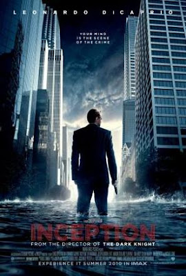
I was skeptical going into the theater last night to see Christopher Nolan's latest work, Inception. It's nearly impossible to shake the Batman connotations. He's the same guy who directed 2005's highly-acclaimed Batman Begins and 2008's orgasmically-acclaimed The Dark Knight. I'm skeptical because although I really liked The Dark Knight, I didn't think it was the greatest film of all time, like many seem to believe it is. To make matters worse, the primary Inception theatrical poster is nearly identical to one of The Dark Knight's theatrical posters.
I hoped this wasn't just cashing in on Batman's (or really, the Heath Ledger's) success. After all, the premise was intriguing: manipulating dreams. And the film features one of my biggest man-crushes, Cillian Murphy of 28 Days Later fame. And the week of the film's release, it was universally praised by critics. So I thought I'd finally cave in and see it.

It's a great film. The psychology of it all immerses you in the experience and makes you really think deeply about it. The characters talk about a lot of things pertaining to dreams that we've all contemplated but not put into words. The idea that when you sleep for five minutes, your dreams can feel like they last an hour. The idea of never remembering how dreams begin: we always start in the middle of everything, in medias res. And there are always things we know are wrong--your girlfriend's hair is red instead of brown, or everyone has three arms--but we don't really think about the fact that they're wrong until after we wake up. The film explores how while we only use a fraction of our brainpower when we're awake, we can use it all when we're asleep, because we're fully connected to our subconscious; we can dream as fast as we can think.


The crux of the story revolves around controlling one's dreams, actively using your subconscious to shape the dreams however you want. In addition, there's this concept of "shared dreams," where you can go into someone else's dream and interact with it. However, the more you disturb their dream, the more their "projections" of people within the dream will realize you don't belong there, and become hostile. People don't leave this dream world unless they wake up in real life, or die in the dream.
Unfortunately, Inception falls into both the trappings of being a Hollywood film, and earning a PG-13 rating. Hollywood means the film is full of stars: Leonardo DiCaprio and Ellen Page play the leads. While they don't ruin the movie, they're not exactly riveting actors either. And while the film's concept seems like it would provide endless possibilities for crazy dream scenarios, the accessible mainstream nature of the movie means instead of acid trips or social statements, the dreams the story takes place most in are...

  • A car chase through New York City

  • A fight in a fancy hotel, and

  • An attack on a snowy military base.
Because we haven't seen those scenarios thousands of times before in cinema. An immaculate idea becomes a wasted opportunity, as the characters spend most of the time doing things they could've done in the real world without this sweet dream-controlling ability.

I'm also disappointed Inception went for a money-making PG-13 rating. "But Jake! The Lord of the Rings, your favorite movies of all time, are PG-13!" you may retort. But not all PG-13s are created equal. The Lord of the Rings was based on an epic fantasy tale written in the '30s and '40s, and published in the '50s. It was great filmmaking without needing more blood and swearing or more controversial, risky decisions--making such an epic film trilogy in the first place was risky enough. Inception, on the other hand, is a modern psychological thriller written for the 21st century. Yes, people actually bleeding when they get shot would have been nice, but I truly believe this film could've been so much more with an R rating. The dreams could've been made more disturbing and "out there," the subplot involving DiCaprio's character and his deceased wife could have been much deeper and more twisted, and Inception would've benefited as a whole. Instead, Nolan & Co. went for PG-13, because adults would still see it while at the same time capturing the lucrative "teenagers spending their parents' money" demographic.
In the end, though, I can overlook these faults because if you just take Inception for what it is and roll with it, it's an engrossing film experience. Its psychology is thought-provoking, and the concept makes you walk out of the theater thinking about it more. I'd be willing to bet if I watch this movie a second time, I'll get more out of it, and that's the sign of good cinema. Plus, Sir Michael Caine appears in a couple scenes, and he's one of my favorite people ever. It's not a Picture of the Year, but Inception is worth a viewing or two.

Monday, July 26, 2010

Ranking the flags of the world!

I've got a thing for flags. I sifted through every current national flag in the world, and here are my ten favorites. If you don't know anything about flag design, take a gander at North American Vexillological Association's official flag principles! Fun times!

10. Bhutan: A simple yet unique color scheme that features Druk the Thunder Dragon, badass national symbol of Bhutan. Normally I would complain about the complexity of the dragon (flags should be simple), but the fact that it's only in black and white and the way it goes along the diagonal line in the flag makes for a great design.

9. South Africa: After apartheid ended in 1994, South Africa replaced its old flag with this new one to reflect its title of the "Rainbow Nation." The red, white, and blue horizontal stripes still evoke the country's Dutch history, but with an injection of green, gold, and black, colors of Africa. NAVA principles dictate you shouldn't use more than three colors in a flag, but it is very well executed here.

8. Uganda: This is another flag with a unique color scheme. There is no traditional green, but the black / yellow / orange combination still looks distinctly African while at the same time setting this flag apart. Six uninterrupted horizontal stripes is fairly rare among flags, and the Grey Crowned Crane in the middle matches the rest of the design.

7. Angola: This is about an evil (in a 007 sort of way) a flag as you can get. The devious shades of red and black, combined with the gold emblem of a gear, a star, and a machete, add up to "Diabolical Soviets from a Bond film." But it's very distinctive. In 2003, a
new, more optimistic flag was proposed, but it was never adopted. Because deep down, they all know this flag is great.
6. Algeria: This is a classic design. The green and white look distinctly North African, and the star & crescent represent Islam (duh). It's very expressive while retaining its simplicity. The Algerian flag's magnificence first really hit me this summer during the World Cup, since they were the team against whom Landon Donovan scored his wondrous stoppage time game-winner. Their fans had such great flags!

5. Dominican Republic: The alternating blue and red quadrants on the white cross are what get me. Although I love this flag, there's something creepily "meta" about it. The crest in the middle of the Dominican flag consists of... Dominican flags. It's like one of those pictures-of-picture-of-a-picture infinite loop images.
4. Brazil: The circle on a rhombus on a rectangle design works great here, and Brazil's colors of green, yellow, and blue work well together. There's a lot of intricacy in the blue circle, depicting Southern Hemisphere constellations, but it still works as a simple whole--if you squint your eyes and look at it, you can still tell it's the Brazilian flag. It's hard to implement green as the most prominent color on a flag, but this one pulls it off.

3. Barbados: For such a small country, this is an epic flag. It's only got a few elements of design, but it's very bold. The shade of gold used here is A+, and the "broken trident" taken from the image of Britannia both works in Barbados' British heritage while at the same time showing its connection to the ocean. Dark blue and black usually don't work well together on a flag, but the gold that separates them makes it cohesive. The Barbados flag makes me think of this next one...

2. Canada: This flag. Simple and powerful, the maple leaf design is synonymous with the country. On top of that, if you look at the white negative space created by the leaf, you can see two men looking at each other, often cited to reference the dual cultures of English-speaking and French-speaking Canadians. In addition, the flag is a slightly disproportionate 1:2, meaning it's longer and slimmer. This makes it stand out among other national flags.

1. Uruguay: The Uruguayan flag is righteous. The white field with blue stripes is unusual in a good way, and it works well to make it "white with blue" and not "blue with white" The kicker is the canton: the sun. It's a sun with a face. The Sun of May, to be exact. It shows Uruguay's history while at the same time giving a friendly face to the nation. I want to be friends with this sun. It's as if the sun is hanging out on the beach, with a white-and-blue striped beach towel. I love it.

Sunday, July 25, 2010

City of Men: City of God Lite

About a week ago, I reviewed City of God. It was a sprawling 2002 epic about the slums of Rio, and one of the most renowned Brazilian films of all time. Its success led to a TV show called City of Men which ran for four seasons, and in 2007 was adapted into this film of the same name. Fernando Mereilles has moved from director to producer, and the two lead actors carry over from the first film.
City of Men is very well-made. The cinematography in particular is stunning--there are some beautiful shots of the shanty towns lit up at night that were not present in its predecessor.
But unfortunately, it lives in its predecessor's insurmountable shadow. City of God's scope was wider, its message was stronger, its characters more memorable and its child violence more disturbing. City of Men is a great movie, but it would be like making a "pretty good fantasy film" as a spiritual successor to The Lord of the Rings.
City of Men is a solid film on its own and out of filmic context, but in relation to what came before, it's merely a supplement. I started the movie expecting "not nearly as good as the first film, but still good," and that's exactly what I got. The problem with masterpiece cinema is figuring out what comes afterward.


Friday, July 23, 2010

International hockey jerseys: the countdown!

As I mentioned in my Spurs kit review, I've got a thing for uniforms. Let's start off by looking at international hockey sweaters! The last major tournament was the 2010 Winter Olympics, so those are the uniforms I'll be analyzing. Thanks to Icethetics.info for the great photos.
Nike made the jerseys for all twelve teams in the Olympics this year, so there are certain similarities between them. A number of the sweaters have the same name/number font, which happens to be the Vancouver Canucks' letter style... wonder if it's a coincidence, since that's where the Olympics were.

12. Switzerland (also wears a
red jersey)

All twelve uniforms are fairly solid, but Switzerland's is the weakest. The Swiss cross is on the left breast like a soccer shirt, but that doesn't work in hockey. They've got all this extra real estate to work with, but all they do here is put a little cross in the corner. A big cross emblazoned across the chest would have looked great. Otherwise, it's a fairly simple uniform which works because of the simplicity of Switzerland's flag.

11. Russia (also wears a white jersey)

Russia has a great crest: a two-headed eagle. I wish it was bigger. But the blue accents on the red uniform don't match well at all, and look very elementary. I also believe if you have a logo, like the eagle, you shouldn't have your country's name spelled out below it, because presumably the role of the crest is to represent your team, so the written name is redundant. However, I appreciate that the word "Russia" is spelled out in Russian, instead of in English. There's so much more potential for the sweater than this. A nice touch is the watermark on the sleeves and waist you can only really see close-up, and don't show up on TV (check the image above of the white jersey, it's easier to see there).

10. Norway (also wears a white jersey)

Norway's uniforms are interesting because they're one of only two teams at the tournament, along with Sweden, to have a lace-up collar. The blue stripes on the sleeves, waist, and socks are great; they're very Norwegian. In place of a logo is "NORGE" diagonal across the front of the sweater, New York Rangers style (bonus points for spelling it in Norwegian instead of English). It's a very classic look, but Norway isn't a country with a winning and storied hockey tradition, so it's puzzling why they'd go so old-school. A team like theirs should be looking toward the future with a more modern look. This one is smartly designed but falls a bit flat.

9. Czech Republic (also wears a red jersey)

Four teams so far, four red jerseys. I'm torn over the Czech Republic's sweaters. I should love them. They feature a great national crest--coats of arms are always a success with me, as they're both very symbolic of the team and they just look classy. The Czech crest stands alone without the country's name underneath, which is smart design. And the name/number font used on the uniforms is unique among international hockey teams. But there's just something about these sweaters that leaves a bad taste in my mouth. Perhaps it's the striping, which seems very casually designed and of no real meaning to the team or country.

8. Slovakia (also wears a white jersey)

Naturally, after the Czech Republic comes Slovakia. Finally, a national team that doesn't wear red! This may be part of the reason I like Slovakia's sweaters so much. On top of that, the specific shade of blue used on the uniform is eye-catching. This is probably the best usage of Nike's standard hockey jersey template of any international team. The Slovak national crest is simple yet distinctive, works well with the rest of the uniform, and is thankfully devoid of the country's name spelled out underneath. My main issue with this uniform is that while it's a great execution of a modern jersey, it works a bit too well with Nike's template. There's nothing that makes Slovakia's jerseys stand out in the crowd besides the fact that it's blue.

7. Canada (also wears a red jersey)

I want to hate this jersey so badly. It's big, bad Canada. It's another team in red. Below the logo is the name of the country, which is redundant (although I can't complain about the language of the country name, since Canada is "Canada" in both English and French). But it's hard to think of anything I would change about Canada's sweaters; they are Team Canada. Many Canadians were super pissed they weren't allowed to use the Hockey Canada logo during the Olympics (since national hockey federation logos are considered advertisement), but this one is even better. If you look closely, it's beautiful. The numbering and lettering font is different from most other teams, very matter-of-fact and very Canadian. Most teams suffer from their white jersey being not nearly as great as their dark jersey, but Canada has two equally iconic sweaters.

6. Belarus (also wears a white jersey)

There are a couple obvious design red flags in Belarus' jersey. It features a crest as well as the country's name underneath, and the name is in English instead of Belarusian or Russian. But I love that this is the first uniform on my list that features a color other than red, white, and blue as a primary color: green. The team may not be very talented (in fact, it looks as if the goalie in the picture is lamenting after a goal has been scored against him), but green on an international hockey sweater is awesome. And I love the crest of Belarus: instead of a fierce animal or medieval shield, it's wheat. And flowers.

5. United States (also wears a white jersey and third jersey)

Like our Neighbors to the North, many Americans were pissed Team USA couldn't use the USA Hockey logo on their jerseys. I, however, think that's fantastic. The USA Hockey logo sucks. Instead, we've got a great lettermark reminiscent of the 1980 Miracle on Ice uniforms. The dark blue with red around the waist is patriotic without being cheesy about it. The Canucks lettering and numbering font looks better on the USA jersey than on any other international sweater. Plus, much like the Russian jersey, there's watermarking on the sleeves and waist that can't be seen unless you're up close. In addition, the white away jersey isn't just a color palette swap of the blue sweater, and looks solid in its own right. The third jersey is a throwback to the other gold medal-winning USA team, the 1960 squad. It's very Rangers-ey; I wouldn't want it to be the home or away sweater, but for a third, it's alright.

4. Finland (also wears a blue jersey)

Finland's sky blue jerseys are majestic. Click the link above--Icethetics hasn't posted pics of the blue uni yet, so my photo to the left is the inferior white sweater. The blue stands out and gets you thinking Finnish. The crest is ancient and righteous, and although the name of the country accompanies it, the name has better placement and font than on other teams' jerseys, and it's the Finnish "Suomi," not "Finland"--there have been Finland jerseys in the past with the country name in English, so I'm glad these ones are in the native tongue. With the exception of a certain other Scandinavian country that has yet to be named, no other international hockey team has such an immediate color association as sky blue and Finland.

3. Germany (also wears a white jersey)

Germany is a rising power in the hockey world, but their uniform speaks with authority. A striking black sweater with eagle detail watermarks on the sleeves, it's an instantly recognizable jersey. The German black eagle coat of arms looks great, and although the name of the country is below, once again, it's written in German, which is good. Some people think black is overused in the NHL these days, but on the international level, it's a unique color scheme which stands out in a world of red, white, and blue. Yellow also pervades Germany's uniform, adding another element not seen on many international jerseys. Recently at the World Championship in Germany, they began wearing an all-yellow third jersey which looks even better than the standard white away jersey; hopefully the yellow will replace the white soon.

2. Latvia (also wears a white jersey)

You wouldn't expect a little hockey country like Latvia to make the #2 spot on this list. But their beautiful maroon color and smart integration of the word "LATVIJA" (in Latvian) into the waist of the sweater complement perhaps the best coat of arms of any international hockey team, the silver and white going great with the maroon. Teams with a uniform of these colors are few and far between; I'd like to see it more. Coincidentally, a club team that does have this color scheme is the only KHL team based out of Latvia, Dinamo Riga. Nearly the entire Latvian national team comes from this one club team.

1. Sweden (also wears a blue jersey)

Was this ever in question? Sweden is the only major international team with a non-white light jersey. Instead, they've got the iconic yellow. Besides Norway, this is the only uniform with the classy lace-up neck. The Tre Kronor is a flawless logo, and coincidentally, there's no "SWEDEN" written below it. This is arguably the best uniform in all of hockey. Since the Swedish national team was founded in 1920, this uniform has been virtually unchanged. It's perfect. It flows better than the Team Canada uniform, it's more creative than the Montreal Canadiens uniform. I wish I had more to say about this uniform, but it's perfect.

I know the Olympics happened a while ago, but I won't get another chance to rank these uniforms until 2014! Sometime next week or so, I'll be ranking World Cup kits. That will have to be more than double the length of this entry. Epic.

Thursday, July 22, 2010

Player gender and race in video games


When you play a video game that lets you create your character, what do you make them look like?
Overwhelmingly, people choose to make the avatar their own gender and race. Searching for the reason why, one's first natural instinct is to think, Players create avatars that look like them to immerse themselves in the game. But you'll give your guy chiseled abs and a sharp jawline even if you don't have them. The argument becomes People create idealized versions of themselves. This holds more water, but I'm not sure it fully explains why players almost never stray from their own sex and ethnicity. Players change many things that aren't "ideal" for them: they'll give their character a neon blue mohawk or a handlebar moustache, but they still stick to their race and sex. Even in fantasy games like The Elder Scrolls that offer non-human species like reptilian and feline humanoid races, most gamers I've talked to avoid these groups on their first playthrough.


As Lauren points out to me, however, "Sex and race are the parts of us that we can't change. Even if you don't have a blue mohawk, it would be possible to grow one; you just don't want one in real life. So with your avatar you can create this more outrageous version of yourself. You could never actually turn yourself Asian, though, whether you wanted to or not, and it would be weird if the 'ideal, outrageous' version of yourself involved you being another ethnicity."
It's a good point. But I'm not convinced "outrageous idealism" and subconscious ethnocentrism are mutually exclusive. It's no coincidence main characters in games with non-customizable avatars are predominantly white males; white males make up the largest demographic of both gamers and game developers.
Yes, there are a smattering of games with female and non-white leads, but the video game industry runs on franchises. The Price of Persia series is arguably the only major franchise with a non-white lead, and it's a whitewashed version of Iran. The biggest single game with a dark-skinned main character was Grand Theft Auto: San Andreas, and naturally, it was a story of street gangs.
The only two major franchises with consistent female main characters are Tomb Raider and Metroid, and both of those series' sales are nowhere near the white male giants of Mario, Halo, The Legend of Zelda, and Call of Duty. Imagine if at the end of Halo 3, Master Chief finally took off his helmet to reveal he's black or Arab. How do you think the Halo-playing populace would react?


But back to games with customizable avatars. If you're a white guy like me, next time you play Fallout, try being a hispanic woman. See if it changes the way you think about your character or the way you react to events in the game. I believe that deep down, we choose the gender and ethnicity we're familiar with because it's exactly that--familiar. It's comfortable to us. Video games are a unique artform because they allow us to personally walk a mile in someone else's shoes. You love walking in a pro athlete's cleats and a space marine's boots. Now try walking in heels.