Upon starting Nancy Farmer's young adult novel The House of the Scorpion, I was taken aback by the wealth of information. Not at the end of the book, but at the beginning appears a short appendix: a cast of characters and family tree.
This immediately made me think of Peter Watts' Blindsight, another sci-fi book with this sort of paratext, albeit much more in-depth. The House of the Scorpion is intended for "ages 11 and up;" it's preparing middle school kids for books like Blindsight later on in life.
Once I made this connection, more paratext similarities began to appear (by the way, I'm reading the 2004 paperback edition of The House of the Scorpion, and I've got the 2006 paperback edition of Blindsight). Despite having different publishers, both books are nearly the exact same dimensions, and the title pages of both books feature words in black lettering with an accompanying design in gray.
What is the purpose of appendices in books? Why do they appear in science fiction so often, both adult sci-fi and sci-fi for kids? Perhaps it's the very definition of science fiction that we grapple with so often: supernatural worlds justified through specific explanations. Unlike fantasy, science fiction seeks to have rational reasoning for everything going on.
But arguably the most famous appendices for a work of fiction appear at the end of J.R.R. Tolkien's The Lord of the Rings, the quintessential fantasy epic. In fact, Tolkien explains nearly everything in his world; his description of Elvish languages are so detailed that there are people who study it and have learned to speak it in the real world.
Does this make The Lord of the Rings science fiction? Probably not. But it's fun to think about.
Wednesday, November 30, 2011
Monday, November 21, 2011
Acknowledgements in the Second Person
"Blood makes noise."
-Suzanne Vega
Imagine you are Peter Watts.
Blindsight is your first novel-length foray into deep space--a domain in which you have, shall we say, limited formal education. In that sense the book isn't far removed from your earlier novels: but whereas you may have not known much about deep-sea ecology either, most of us knew even less, and a doctorate in marine biology at least let you fake it through the rifters trilogy. Blindsight, however, charts its course through a whole different kind of zero g; this made a trustworthy guide that much more important. So first you can thank Prof. Jaymie Matthews of the University of British Columbia: astronomer, partygoer, and vital serial sieve for all the ideas you threw at him. You can also thank Donald Simmons, aerospace engineer and gratifyingly cheap dinner date, who reviewed your specs for Theseus (especially of the drive and the drum), and gave you tips on radiation and the shielding therefrom. Both parties patiently filtered out your more egregious boners. (Which is not to say that none remain in the book, only that those which do result from your negligence, not theirs. Or maybe just because the story called for them.)
You'd scream if you had the breath.
David Hartwell, as always, was your editor and main point man at Evil Empire HQ. You suspect Blindsight was a tough haul for both of you: shitloads of essential theory threatened to overwhelm the story, not to mention the problem of generating reader involvement in a cast of characters who were less cuddlesome than usual. You still don't know the extent to which you succeeded or failed, but you've never been more grateful that the man riding shotgun had warmed up on everyone from Heinlein to Herbert.
Vampires did this all the time, you remember. It was normal for them, it was their own unique take on resource conservation. They could have taught your kind a few things about restraint, if that absurd aversion to right angles hadn't done them in at the dawn of civilization. Maybe they still can.
The usual gang of fellow writers critiqued the first few chapters of the book and sent you whimpering back to the drawing board: Michael Carr, Laurie Channer, Cory Doctorow, Rebecca Maines, David Nickle, John McDaid, Steve Samenski, Rob Stauffer, and the late Pat York. All offered valuable insights and criticisms at your annual island getaway; Dave Nickle gets singled out for special mention thanks to additional insights offered throughout the year, generally at ungodly hours. By the same token, Dave is exempted from the familiar any-errors-are-entirely-yours schtick that you authors boilerplate onto your acknowledgments. At least some of the mistakes contained therein are probably Dave's fault.
You think: That can't be right.
Professor Sample told us to re-write an important scene in Peter Watts' Blindsight from a different character's perspective. I suspected most of the class would either do a scene from the very beginning of the novel, or the very end. I spent forever trying to figure out how to do something different.
One of the most notable aspects of Blindsight is the extensive background research Peter Watts did for the book. The novel's notes and references section looks like it came straight out of a science textbook.
It reminds me of the painstakingly detailed appendices at the end of J.R.R. Tolkien's The Lord of the Rings. Tolkien was not only a novelist: he was a philologist at Oxford. Middle-earth is so convincing in his works because it's rooted in Tolkien's deep interest in language and history.
In that same vein, Peter Watts' rich world in Blindsight is rooted in the mountains of scientific research he did beforehand. You don't need to read any of it to enjoy the book--just like you don't need to read the appendices of The Lord of the Rings to appreciate Tolkien. But it adds an element of believability and fullness to the world of the fiction.
 So I knew I had to tackle Watts' research for this assignment. But what other perspective could I use?
Another of Blindsight's peculiarities is its strategic use of second-person narrative. Often reserved for Choose Your Own Adventure books, second person aims to immerse the reader more in the story. What better way to approach the research of Blindsight?! I combined the first few paragraphs of the book's acknowledgments section with snippets from the opening second-person narration of Blindsight's actual story.
Despite the commanding "You" article, second person seems more stream-of-consciousness to me than Watts' first-person, even though most of the words are identical. With the perspective flipped, Watts' humble self-effacing comments come off as much more melancholy instead of humorous. The ominous lines from the beginning of the novel add to that.
On a completely unrelated note, this all made me think about second person in video games: is it possible? In a game where you play as not a defined character but a blank slate of a re-nameable, customizable avatar, could you argue it's second-person storytelling? You're not playing as Mario or Master Chief. You're playing as you.
Labels:
Blindsight,
Peter Watts
Monday, November 14, 2011
Portal is Metroid
My last posts were about how similar the beginning of Portal is to Lilith's Brood.
As I got to the end of Portal, I realized how similar it is to another important work of sci-fi: Nintendo's 1986 Metroid.
Metroid is notable for being the first major video game with a female protagonist, although this is not a major selling point like it is for a game like Tomb Raider. Main character Samus' gender is not revealed until the very end of the game, when she takes off the helmet of her space suit to reveal that she's a woman.
Samus is a silent protagonist in an orange suit, dropped into an unfamiliar landscape with minimal exposition or context. She treks deeper and deeper into the underground tunnels of the Space Pirate base on planet Zebes. In the final boss battle, she encounters Mother Brain, hooked up to the core of the station and controlling it all. When the antagonist is vanquished, the entire station self-destructs and Samus barely escapes.
When playing Portal with developer commentary, the developers say an original prototype of antagonist GLaDOS was... a floating brain. And then it all clicked.
Chell is a silent protagonist in an orange suit, dropped into an unfamiliar landscape with minimal exposition or context. She treks deeper and deeper into the underground tunnels of the Aperture Science laboratories. In the final boss battle, she encounters GLaDOS, hooked up to the core of the station and controlling it all. When the antagonist is vanquished, the entire station self-destructs and Chell barely escapes.
In class, we talked about how notable it is that Portal is one of the first major games with both a female protagonist and a female antagonist.
Metroid famously has a female protagonist, too, and although brains are fairly genderless, Nintendo felt the need to name the game's antagonist... "Mother" Brain.
Metroid precedes Portal by over two decades.
Tuesday, November 8, 2011
One last note on Portal & Lilith's Brood
After I posted my piece on the incredible similarities between Portal and Lilith's Brood, another thing hit me:
Neither Chell nor Lilith can exit their prison cell. They must wait for their captors to open doors or walls for them. Eventually, their captors give them this ability, but it's still limited compared to what the captors can do. Even with more "freedom," they're still both trapped.
Neither Chell nor Lilith can exit their prison cell. They must wait for their captors to open doors or walls for them. Eventually, their captors give them this ability, but it's still limited compared to what the captors can do. Even with more "freedom," they're still both trapped.
Wednesday, November 2, 2011
Lilith's Brood through the portal of Portal
Lilith's Brood is about a strong female character held alone in confinement in a pristine cell by unseen, technologically advanced captors who she initially hears only through some sort of public address system. She begins the story by waking up from slumber--she can't remember how long she slept or how she got to this place. She wears clothing given to her by her captors. As she learns more, she discovers her captors are using her as an experiment, and already surgically "enhanced" her body before her journey even started.
Portal is about a strong female character held alone in confinement in a pristine cell by unseen, technologically advanced captors who she initially hears only through some sort of public address system. She begins the story by waking up from slumber--she can't remember how long she slept or how she got to this place. She wears clothing given to her by her captors. As she learns more, she discovers her captors are using her as an experiment, and already surgically "enhanced" her body before her journey even started.
The stories diverge slightly after the first few chapters, but these similarities are uncanny.
I can't wait to dicuss Portal in class.
Monday, October 24, 2011
Crappy romance novels and Lilith's Brood, or Why Book Covers Matter
The first thing I heard about Lilith's Brood was a disclaimer: don't judge this book by its crappy romance novel cover. A naked woman covering her breasts with her hands, under white sheets.
But this is a classic science-fiction trilogy, I thought to myself. I must perservere!
Despite my most valiant efforts, I can't get past this book cover. Covers make a huge first impression on prospective readers, and I've never understood why they go overlooked so often. Why does the moody painting on The Great Gatsby's cover have to have an unnecessary white box around it? Why can't authors stop their great novels with film adaptations from getting the obligatory movie poster cover?
Imagine if the Beatles hadn't had control over the cover of Sgt. Pepper's Lonely Hearts Club Band or Abbey Road. What about Jimi Hendrix's Axis: Bold as Love or Nirvana's Nevermind or A Tribe Called Quest's Midnight Marauders?
Even in today's music market where album sales are bottoming out and everyone buys 99-cent singles on iTunes, album covers make a difference. When Kanye West released his My Beautiful Dark Twisted Fantasy last year, its cover made perhaps more waves than the music itself. A huge controversy ensued, and regardless of what you think of Kanye's music, it's clear he cares about cover art.
Why can't literature be afforded the same artistic integrity? The most successful novels go through dozens of different book covers, hardly any of them with input from the authors themselves. Sometimes a writer like Shel Silverstein will fight tooth and nail to get exactly the artwork he wants, but then again, Silverstein was also the artist. It's tough for writers who just write.
So what about Lilith's Brood? The woman on the cover barely looks like how protagonist Lilith is described in the novel. The top of the photographed woman's head is blurred out--her only distinguishable traits are her curly hair and that ethnically, she's probably black.
The woman appears to be in a very sensual situation, but this is a disservice to the protagonist--Lilith is an empowered female character. The cover insinuates her sexuality should be front and center in the reader's mind.
Does this matter? Octavia E. Butler, the author, is a bit of an anomaly. In an industry full of nerdy white men, she was one of the only prominent African-American female sci-fi authors. Did Grand Central Publishing give Lilith's Brood a romance novel cover because they think men won't read a book written by a woman? Is the woman on the cover black simply because Butler was black?
At the end of the day, despite whatever cliché your teachers and parents may espouse, book covers matter. They're our portal into the world of the story, and it's a shame the publishing industry wants to make these portals as inconsequential as possible.
Tuesday, October 18, 2011
Violence in We3
I love violence. A list of my all-time favorite movies would undoubtedly include such family-friendly classics as Battle Royale, 28 Days Later, and Kill Bill.
But the violence in Grant Morrison and Frank Quitely's We3 bothers me. It seems unnecessary. Gore has a place in fiction when it serves a purpose, whether that's furthering the storyline or evoking a mood. We3's blood and guts simply evoke the mood of "gross" to me. It doesn't hook me in, it doesn't make me empathize with the characters or despise the characters. It just comes off as frivolous.
Let's take this scene halfway through the comic, for example (I apologize for the low scan quality). Our protagonists are escaping across a bridge when they get ambushed by a horde of cyborg rats. The two-page panel on top is the establishing shot, showing all the action with all the characters on an identifiable background.
Quitely cleverly conveys depth in the image by silhouetting the rats on the bridge supports in the foreground. We see Tinker and Bandit reacting to the attack, snarling with teeth bared. Pirate escapes off to the right. This panel works. It tells the story and illustrates the emotions of the characters. Now let's look closer.
 Two triangular panels follow: a close-up of Bandit viciously chomping a rat in two, and the We3 crossing to the other side of the bridge.
What was the point of that chomp?
It illustrates that Bandit is fighting back. But does the scene evolve into a full-on battle between the rats and the We3? Nope. They continue their escape in the next frame. If the chomping frame were taken out completely, the reader would not have lost any information.
"But comic books are more than just the plot line," you may assert. So what deeper feeling does the chomp convey? That Bandit kicks ass? We see plenty of ass kicking through the rest of the comic. That the rats are stupid and expendable? We definitely see that throughout the rest of the story. This particular panel brings absolutely nothing to the table, except for one thing: violence.
This is violence for violence's sake. It's the wrong way to do gore. Yes, the rat's guts are realistic and detailed, but all this does is satisfy readers' bloodlust. It's The Human Centipede of comic book frames.
Don't get me wrong. Gore can be done right. It's even done right in other parts of We3. The early scene where the scientist is demonstrating the drill-rats to government officials comes to mind; this is a scene where the unsettling violence makes us feel a certain way towards the humans involved and helps deepen our attachment to the story. Unfortunately, this is only a small percentage of We3's violence. The rest is like Bandit chomping a rat in half: bloody filler.
But the violence in Grant Morrison and Frank Quitely's We3 bothers me. It seems unnecessary. Gore has a place in fiction when it serves a purpose, whether that's furthering the storyline or evoking a mood. We3's blood and guts simply evoke the mood of "gross" to me. It doesn't hook me in, it doesn't make me empathize with the characters or despise the characters. It just comes off as frivolous.
Let's take this scene halfway through the comic, for example (I apologize for the low scan quality). Our protagonists are escaping across a bridge when they get ambushed by a horde of cyborg rats. The two-page panel on top is the establishing shot, showing all the action with all the characters on an identifiable background.
Quitely cleverly conveys depth in the image by silhouetting the rats on the bridge supports in the foreground. We see Tinker and Bandit reacting to the attack, snarling with teeth bared. Pirate escapes off to the right. This panel works. It tells the story and illustrates the emotions of the characters. Now let's look closer.
 Two triangular panels follow: a close-up of Bandit viciously chomping a rat in two, and the We3 crossing to the other side of the bridge.
What was the point of that chomp?
It illustrates that Bandit is fighting back. But does the scene evolve into a full-on battle between the rats and the We3? Nope. They continue their escape in the next frame. If the chomping frame were taken out completely, the reader would not have lost any information.
"But comic books are more than just the plot line," you may assert. So what deeper feeling does the chomp convey? That Bandit kicks ass? We see plenty of ass kicking through the rest of the comic. That the rats are stupid and expendable? We definitely see that throughout the rest of the story. This particular panel brings absolutely nothing to the table, except for one thing: violence.
This is violence for violence's sake. It's the wrong way to do gore. Yes, the rat's guts are realistic and detailed, but all this does is satisfy readers' bloodlust. It's The Human Centipede of comic book frames.
Don't get me wrong. Gore can be done right. It's even done right in other parts of We3. The early scene where the scientist is demonstrating the drill-rats to government officials comes to mind; this is a scene where the unsettling violence makes us feel a certain way towards the humans involved and helps deepen our attachment to the story. Unfortunately, this is only a small percentage of We3's violence. The rest is like Bandit chomping a rat in half: bloody filler.
Labels:
Frank Quitely,
Grant Morrison,
We3
Monday, September 26, 2011
In medias res in Neuromancer
William Gibson's 1984 Neuromancer is pretty dense. It begins right in the middle of things, and never explains the science fiction world's background. We the readers must piece it together on our own. Initially, main character Case seems like a sort of deadbeat alcoholic American living in future Japan. Well, we assume he's American. North America is referred to only as the Sprawl.
.jpg) We figure out that some sort of apocalyptic event happened to North America (I specify "North America" instead of "United States" because Gibson is American-Canadian), and there's a wave of shady immigrants from this Sprawl now living in Japan. The story takes place in Chiba, a real-life suburb of Tokyo. This is important. I don't think the world of Neuromancer would seem as gritty or real if it took place on some distant planet; the fact that it's a place that exists in the real world, even if it's across the Pacific, makes it a bit more identifiable.
We figure out that some sort of apocalyptic event happened to North America (I specify "North America" instead of "United States" because Gibson is American-Canadian), and there's a wave of shady immigrants from this Sprawl now living in Japan. The story takes place in Chiba, a real-life suburb of Tokyo. This is important. I don't think the world of Neuromancer would seem as gritty or real if it took place on some distant planet; the fact that it's a place that exists in the real world, even if it's across the Pacific, makes it a bit more identifiable.
The iconic first line of the novel--"The sky above the port was the color of television, turned to a dead channel"--gives way to an opening scene in a bar, with a one-armed futuristic bartender. It's all very evocative, but incredibly foreign as well. We've seen plenty of stories about pubs with troubled inhabitants, but the bartender Ratz with his prosthetic limb makes the scene alien to us.
I've got a point of reference, though: Ridley Scott's Blade Runner, in theaters only two years prior to Neuromancer's release. Both works take place in a dystopian future where Americans bump elbows with the Japanese, and as a result, through my reading of the book I imagine Case as Harrison Ford.
But there's really no exposition. Gibson assumes the reader has a certain level of intelligence, and we have to put the puzzle together ourselves.
.jpg) We figure out that some sort of apocalyptic event happened to North America (I specify "North America" instead of "United States" because Gibson is American-Canadian), and there's a wave of shady immigrants from this Sprawl now living in Japan. The story takes place in Chiba, a real-life suburb of Tokyo. This is important. I don't think the world of Neuromancer would seem as gritty or real if it took place on some distant planet; the fact that it's a place that exists in the real world, even if it's across the Pacific, makes it a bit more identifiable.
We figure out that some sort of apocalyptic event happened to North America (I specify "North America" instead of "United States" because Gibson is American-Canadian), and there's a wave of shady immigrants from this Sprawl now living in Japan. The story takes place in Chiba, a real-life suburb of Tokyo. This is important. I don't think the world of Neuromancer would seem as gritty or real if it took place on some distant planet; the fact that it's a place that exists in the real world, even if it's across the Pacific, makes it a bit more identifiable.The iconic first line of the novel--"The sky above the port was the color of television, turned to a dead channel"--gives way to an opening scene in a bar, with a one-armed futuristic bartender. It's all very evocative, but incredibly foreign as well. We've seen plenty of stories about pubs with troubled inhabitants, but the bartender Ratz with his prosthetic limb makes the scene alien to us.
I've got a point of reference, though: Ridley Scott's Blade Runner, in theaters only two years prior to Neuromancer's release. Both works take place in a dystopian future where Americans bump elbows with the Japanese, and as a result, through my reading of the book I imagine Case as Harrison Ford.
But there's really no exposition. Gibson assumes the reader has a certain level of intelligence, and we have to put the puzzle together ourselves.
Labels:
Neuromancer,
William Gibson
Monday, September 12, 2011
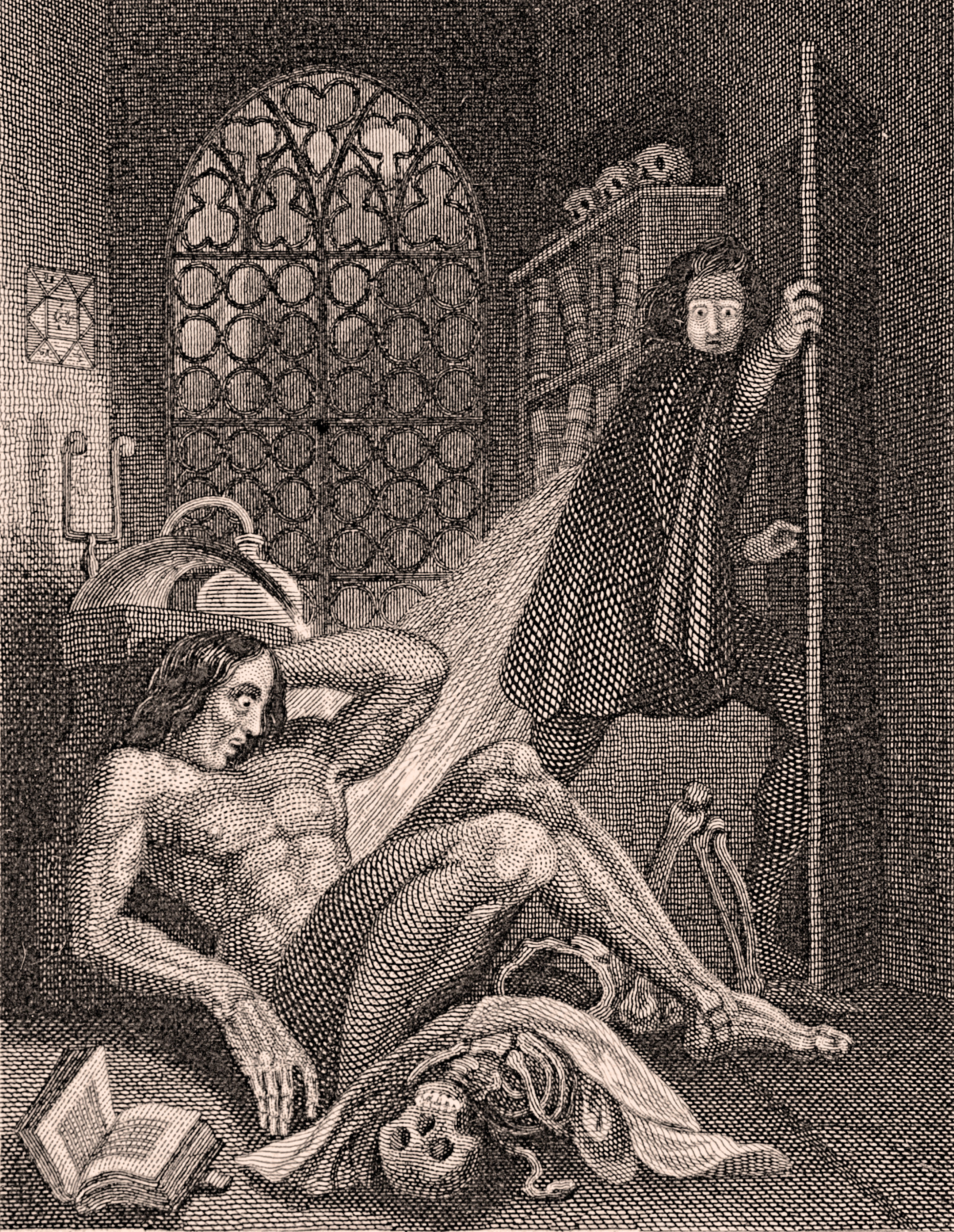
Frankenstein vs. Of Mice and Men
The story of a smart man and his gigantic, burly, innocently-stupid companion who unwittingly kills people. It ends in tragedy.
Is this Frankenstein or John Steinbeck's Of Mice and Men?
On the surface, these two novels have a number of similarities, but once you get farther into the novel, these likenesses run even deeper.
From the time I started reading Frankenstein, I saw parallels between the monster and Of Mice and Men's Lennie Small. But as the story shifts to the perspective of Frankenstein's creature, I realized just how tragically alike they actually were. George is the only difference.
Victor Frankenstein and George Milton are polar opposites in many ways. While Frankenstein is melancholy and reserved, George is outgoing and cynical. Both are greedy, but in different ways. Frankenstein creates his monster for selfish reasons, to fulfill an inner curiosity and play god. George, on the other hand, is a schemer; he wants to work his way up the social ladder and own his own land. George is in and out of work, and doesn't really have any larger dreams other than to make more money.
Ironically, George is much more personable than Frankenstein. The former adopts Lennie and acts as his protector, while Victor is distant towards his friends and family (even his "lover" Elizabeth), and immediately disowns his creation.
 Frankenstein's creature uses violence in an unwitting, childlike way. Lennie is the same way. While Lennie only wants to "stroke" things and ends up accidentally killing them, the monster's violence comes about slightly differently. The monster actually tries to assimilate to human culture, and his murderous tendencies come out because humans don't accept his hideous body, and he's filled with anger over this neglect.
But maybe the monster wouldn't have killed anyone if Frankenstein had been a bit more like George. Frankenstein cannot deal with his creation in any capacity, and virtually all the interactions between the two in the book are hostile. This is mainly Frankenstein's fault. The creature tries to reach out to him, and Frankenstein can't accept him. At one point, Frankenstein agrees to create a female companion for the monster, but that doesn't exactly go as planned.
George is a bit more complex. He stands by Lennie until the very end of the book, where he must "put down" his partner like a pet at the animal hospital. Here's another place where Frankenstein and Of Mice and Men coincide--both novels end with the death of the monsters. Lennie is unknowing and violent until the end; Frankenstein's monster commits (implied) suicide because of remorse over his murder of his creator.
This a strange role reversal. George kills Lennie at the end of his story, and deals with the guilt of this euthanasia but survives. Frankenstein's monster, on the other hand, kills Frankenstein, and then deals with the guilt through his own death. At the end of the day in both novels, everyone's bummed out. But through compassion, George survives his story. Frankenstein... does not.
Is this Frankenstein or John Steinbeck's Of Mice and Men?
On the surface, these two novels have a number of similarities, but once you get farther into the novel, these likenesses run even deeper.
From the time I started reading Frankenstein, I saw parallels between the monster and Of Mice and Men's Lennie Small. But as the story shifts to the perspective of Frankenstein's creature, I realized just how tragically alike they actually were. George is the only difference.
Victor Frankenstein and George Milton are polar opposites in many ways. While Frankenstein is melancholy and reserved, George is outgoing and cynical. Both are greedy, but in different ways. Frankenstein creates his monster for selfish reasons, to fulfill an inner curiosity and play god. George, on the other hand, is a schemer; he wants to work his way up the social ladder and own his own land. George is in and out of work, and doesn't really have any larger dreams other than to make more money.
Ironically, George is much more personable than Frankenstein. The former adopts Lennie and acts as his protector, while Victor is distant towards his friends and family (even his "lover" Elizabeth), and immediately disowns his creation.
 Frankenstein's creature uses violence in an unwitting, childlike way. Lennie is the same way. While Lennie only wants to "stroke" things and ends up accidentally killing them, the monster's violence comes about slightly differently. The monster actually tries to assimilate to human culture, and his murderous tendencies come out because humans don't accept his hideous body, and he's filled with anger over this neglect.
But maybe the monster wouldn't have killed anyone if Frankenstein had been a bit more like George. Frankenstein cannot deal with his creation in any capacity, and virtually all the interactions between the two in the book are hostile. This is mainly Frankenstein's fault. The creature tries to reach out to him, and Frankenstein can't accept him. At one point, Frankenstein agrees to create a female companion for the monster, but that doesn't exactly go as planned.
George is a bit more complex. He stands by Lennie until the very end of the book, where he must "put down" his partner like a pet at the animal hospital. Here's another place where Frankenstein and Of Mice and Men coincide--both novels end with the death of the monsters. Lennie is unknowing and violent until the end; Frankenstein's monster commits (implied) suicide because of remorse over his murder of his creator.
This a strange role reversal. George kills Lennie at the end of his story, and deals with the guilt of this euthanasia but survives. Frankenstein's monster, on the other hand, kills Frankenstein, and then deals with the guilt through his own death. At the end of the day in both novels, everyone's bummed out. But through compassion, George survives his story. Frankenstein... does not.
Wednesday, September 7, 2011
Frankenstein vs. The Terminator
Mary Shelley's 1818 Frankenstein is arguably the world's first true science-fiction novel, the predecessor to modern-day robot stories. One would think Frankenstein's monster is more closely connected to today's zombie flicks (it's risen from the dead, after all), but its connection to artificial intelligence is much more important.
One of the central themes of sci-fi is the idea of "man vs. machine," where computers have advanced so far that they become self-aware and rebel against their human creators. Frankenstein swaps lasers and hard drives for rotting limbs and yellow eyes, but it's the exact same concept.
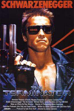
The most iconic Man vs. Machine story in pop culture is without a doubt James Cameron's 1984 blockbuster The Terminator. Set in the near future of 2029 (everyone loves the "near future"), the plot is fairly contrived, but the parallels between it and Frankenstein are astounding. How do they compare?
Both Frankenstein's creature and the Terminator were created by humans at the cutting edge of science. Both had noble intentions that went horribly wrong. Or did they?
Victor Frankenstein is a lonely, melancholy man who seeks mainly to satisfy his own curiosity. The Terminator, however, was created by a United States military super-soldier robot program. Perhaps the mission of "national security" is noble, but as we know from real life, "national security" has been used as an excuse by the U.S. military to do some sinister things.
Neither Frankenstein's monster nor the Terminator are evil by nature. Both are tragic characters, forced into violence by their circumstances. They're small children who break things in their parents' house--not necessarily always by accident, but not for evil reasons, either. It's curiosity mixed with a heavy dose of "not knowing one's own strength."
The audience doesn't immediately empathize with the Terminator nearly as easily as we do with Frankenstein's creature. The tragic side of Arnold Schwarzenegger is not really explained until later in the Terminator franchise.
Why is the Terminator so much more evil? Because it sells more tickets at the movie theater. The Terminator was made to make money. Coincidentally, film adaptations of Frankenstein seem to share much more in common with The Terminator's shallow action than with Mary Shelley's original novel.
When money is thrown at art, we end up with the lowest common denominator of complex expression. This is something else Frankenstein and The Terminator have in common.
So what do you think a Frankenstein film adaptation in 2011 would look like? What should it look like? And why do the "would" and "should" conflict with each other?
Friday, August 12, 2011
Sexuality, puzzle games, and Catherine
I'm not into sleazy Japanese games. I've never played Atlus' acclaimed Shin Megami Tensei: Persona series of RPGs, and never even gave them a second thought until Extra Credits did a fantastic analysis of sexual diversity in games using Persona 4 as the primary example. Then I started thinking more seriously about Atlus. Then I heard about Catherine.
It's got naughty pix abounding, and on the surface seems like your average sleazy Japanese game. But the developers insisted it was a deep exploration of sexuality and adulthood, so I remained interested.
Since Catherine was released in North America last month, plenty has been written about its elegant handling of sexual identities and mature themes. Something fewer people have touched on is the context of all this arty stuff.
It's not an RPG. It's a puzzle game.
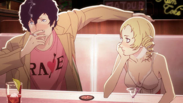
You read that correctly. Catherine's gameplay is split into three parts: lengthy anime cutscenes, RPG-style nights hanging out at the local pub, and the core of the game--Q*bert-style block-climbing puzzles.
But how can a puzzle game have a deep storyline?
We're stuck in the idea that puzzle games have to be simple. All the most iconic puzzle titles are incredibly minimalist: Tetris, Bejeweled, and Lumines don't really have anything at all resembling a story. In fact, they don't even really have a "fiction"; they're just abstract images used to convey gameplay.
There are a few popular puzzle games with slightly deeper fictions. Puzzle Quest features some fantasy RPG elements, and the Professor Layton games feature Studio Ghibli-style art. But in both of these games, the stories are only superficial packaging for the core gameplay, which is still simple puzzle fare at heart.
So does Catherine do anything different than Professor Layton? At the end of the day, the protagonist Vincent could be replaced with a generic stick figure, and the gameplay would still succeed. But the puzzles themselves serve a purpose in the story: they're allegory for Vincent dealing with the emotional consequences of his infidelity towards his girlfriend, and his anxiety towards maturation and adulthood.
Yes, this is still superficial. The puzzles would work without the story. But through their connection to the fiction, they made me feel more invested in Vincent as a character during the non-puzzle sections. We understand the puzzles as explorations of Vincent's psyche, and that immerses us more in the story. As great as Puzzle Quest and Professor Layton are, neither are able to accomplish this, and as a result their stories come off as much more unnecessary. With Catherine, I loved the puzzles, but I can honestly say I wouldn't have enjoyed them nearly as much if it weren't for their deeply-bedded connection to the storyline.
Labels:
Atlus,
Catherine,
Persona Team
Monday, August 8, 2011
Thoughts on Metroid's 25th birthday
Twenty-five years ago this past Saturday, the first Metroid title was released on the Famicom in Japan. Plenty has been written on how the game revolutionized non-linear gameplay, how it broke gender barriers, how its dark, melancholic mood redefined atmosphere in games, and how Team Ninja bastardized the franchise with Other M. You can find all those articles on other websites.
The story of Metroid is really the story of its creator, Gunpei Yokoi. He's by far the most tragic figure in the Nintendo game design pantheon--if Shigeru Miyamoto is gaming's Thomas Edison, Yokoi is Nikola Tesla.
Yokoi's life parallels the story of the Metroid franchise. Both are integral figures at Nintendo, still the most important game company in the world. Both had moments of sheer greatness followed by moments of neglect and disaster. Both are black sheep in the Nintendo family whose legacy is too often forgotten today.
Along with Metroid, Yokoi is the creator of some of Nintendo's most important works. Among them: the Game & Watch, Kid Icarus, the Game Boy, Dr. Mario, and Fire Emblem. While many of these were popular and influential, nothing reached the stardom Miyamoto's creations.
 And there were the failures. In 1985, Yokoi created R.O.B., the Robotic Operating Buddy! It's a cult classic today, but when it was released, it flopped. The plastic robot add-on for the NES only got support from two games, and it was shortly discontinued.
He was also the father of Nintendo's first foray into 3D gaming, the infamous Virtual Boy. Released in 1995, it was such a failure that it led to Yokoi's departure from Nintendo in 1996, after three decades of service.
A year later, he was hit by a car and killed. And today, unless you're a huge gaming enthusiast, you have no idea who Gunpei Yokoi is.
(Side note: I wonder what Yokoi would think of the 3DS. It's the spiritual successor to the Game Boy and Virtual Boy combined!)
What about Metroid? It's often grouped in Nintendo's "holy trinity" with Mario and The Legend of Zelda. But is it really up there? Metroid has never enjoyed the commercial success of its Miyamoto-created brethren.
To me, it's personal. As a kid, Metroid was the first series that made me realize video games could be something deeper as an art form. It's the most important game franchise to me. If it weren't for Metroid, I'd be another 14-year-old boy on Xbox Live chugging Mountain Dew and calling people homophobic slurs in Halo.
So even if Nintendo refuses to acknowledge your existence in 2011: happy birthday, Metroid. And thank you, Gunpei Yokoi. I'll pour one out for ya.
The story of Metroid is really the story of its creator, Gunpei Yokoi. He's by far the most tragic figure in the Nintendo game design pantheon--if Shigeru Miyamoto is gaming's Thomas Edison, Yokoi is Nikola Tesla.
Yokoi's life parallels the story of the Metroid franchise. Both are integral figures at Nintendo, still the most important game company in the world. Both had moments of sheer greatness followed by moments of neglect and disaster. Both are black sheep in the Nintendo family whose legacy is too often forgotten today.
 And there were the failures. In 1985, Yokoi created R.O.B., the Robotic Operating Buddy! It's a cult classic today, but when it was released, it flopped. The plastic robot add-on for the NES only got support from two games, and it was shortly discontinued.
He was also the father of Nintendo's first foray into 3D gaming, the infamous Virtual Boy. Released in 1995, it was such a failure that it led to Yokoi's departure from Nintendo in 1996, after three decades of service.
A year later, he was hit by a car and killed. And today, unless you're a huge gaming enthusiast, you have no idea who Gunpei Yokoi is.
(Side note: I wonder what Yokoi would think of the 3DS. It's the spiritual successor to the Game Boy and Virtual Boy combined!)
What about Metroid? It's often grouped in Nintendo's "holy trinity" with Mario and The Legend of Zelda. But is it really up there? Metroid has never enjoyed the commercial success of its Miyamoto-created brethren.
To me, it's personal. As a kid, Metroid was the first series that made me realize video games could be something deeper as an art form. It's the most important game franchise to me. If it weren't for Metroid, I'd be another 14-year-old boy on Xbox Live chugging Mountain Dew and calling people homophobic slurs in Halo.
So even if Nintendo refuses to acknowledge your existence in 2011: happy birthday, Metroid. And thank you, Gunpei Yokoi. I'll pour one out for ya.
Monday, August 1, 2011
Minimalism in Limbo, and ambiguous endings
Last week, I listed Limbo creators Playdead as one of the best developers in Scandinavia. Today I'll go more in-depth with their game, and explain why the Danish designers deserve such praise despite Limbo being their very first title.
Limbo is minimalist game design in its purest form. Aside from the main menu, there are absolutely no words through the entire story. No spoken dialogue, no text, nothing. There is no tutorial. You are thrown straight into the plot.
You're a small boy unconscious in a forest. The visual style of Limbo is immediately striking--it's entirely in grayscale, with characters all in silhouette. And the music is minimal. No score, no sweeping theme song. Ambient sounds are the only tunes accompanying the boy, supplemented by single orchestral notes at particularly poignant moments.
The boy, who is never given a name, doesn't wake up until the player presses A. But the game doesn't tell the player to do this; they must figure this out on their own. Once he's awake, control is simple. The control stick moves the boy, the A button makes him jump, and the B button lets him push and pull objects in the environment. That's it. Even the boy's jump ability is fairly modest compared to most other 2D platformers.
This isn't an empowered protagonist like we're used to seeing in this medium. It's just a boy. We're left to come to our own conclusions about anything more than that, because there is absolutely no exposition or backstory. SLIGHT SPOILER ALERT We learn about halfway through the game that he's searching for a girl. Perhaps it's his sister, but this is never expanded upon. Again, we're left to come to our own conclusions. END SLIGHT SPOILERS
Limbo is essentially a puzzle-platformer. The boy must manipulate the environment to get through to the next area. But why he's doing this is anyone's guess. And I like it that way.
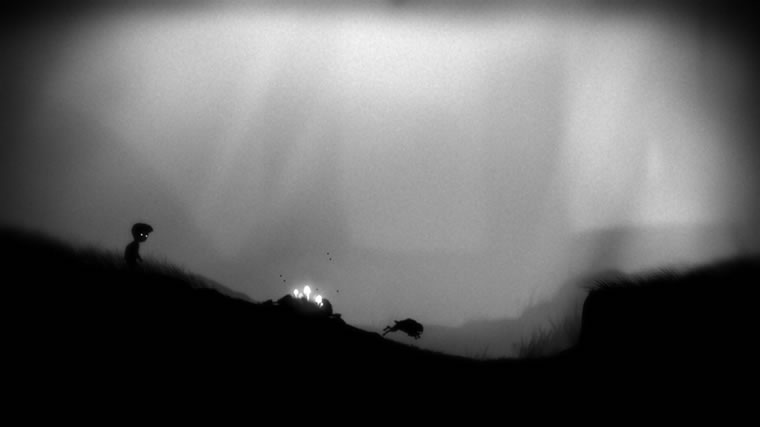 As the boy travels through this forest, it seems everything wants to kill him. A tribe of slightly older boys sets traps for him, and a Shelob-like giant spider wants to consume him. We see the bodies of other children hanging from gallows in the background. There's a very Lord of the Flies feel to it all.
Death is all around the boy. In a particularly disturbing sequence, the boy must conquer the spider chasing him by amputating its legs himself. Once the spider has been fully de-legged, the boy must roll its torso into a spike pit and use it as footing to jump off.
Another factor in all this violence is the realization that this boy cannot swim. Any time he goes underwater, he drowns to death. In one sequence, the boy must use the floating corpses of other children to get across a pond. Death follows the boy everywhere--rotting carcasses of animals are pervasive throughout the forest, and insects follow him everywhere. This grisly subject matter might be too much to handle, but the silhouette art style makes it palatable.
Considering how two-tone the visuals are, his deaths are jarringly graphic. The deaths get increasingly gruesome as the game goes on. Being a puzzle-platformer, the player will die dozens of times in one playthrough. But the boy always reappears quickly next to the trap that killed him, so players can try again. Through the sheer volume of deaths, players get almost desensitized to the violence incurred on this small child.
SPOILER ALERT
There is no "final boss," and I commend Playdead for eschewing this game industry trope. Instead, near the end of a puzzle, the boy shatters through glass and dies. For real. He doesn't respawn to where he can try again. He actually dies.
But then he wakes up again, much like in the beginning of the game. He's in a forest, and he finds the girl he's been searching for. She's near a ladder, sitting down. She looks up. And then the credits roll.
After the credits, we come back to the game's main menu screen. We make the realization that the ending of the game has been staring us in the face ever since we began: the main menu screen shows the ending of Limbo. It's the same forest as the ending scene, with the same wooden ladder. But it's rotting. And instead of the boy and girl, we see two lumps on the ground with insects buzzing around them.
This abrupt ending was very polarizing for players. But to me, it fits. In an experience where he has died countless times in various super-violent manners, this is closure for the boy. He can finally rest. And perhaps "true death" was the only way for him to find this girl. He's finally out of limbo, and can have his eternal sleep.
Or is he? Since the main menu screen is actually the ending, it could mean the boy is forever in limbo. He's back where he started, and now when a new player starts the game, they can take him through the same purgatorial trip again, again, and again until the end of time.
END SPOILERS
But that's just my interpretation of the ending. It's up to you to decide what you think. And that's the beauty of ambiguous endings, something far too scarce in the gaming medium. But it's not the only game like this...
As far as "arty 2D platformers" go, Limbo is often mentioned in the same breath as Jonathan Blow's Braid. But though Braid also features no tutorial and an ambiguous story, Limbo's minimalism puts it firmly on top for me. Braid uses a beautiful orchestral soundtrack and hand-drawn, exquisite visuals. But it reeks of pretension, exacerbated by the endless walls of text between levels presented to give the story meaning. In addition, Jonathan Blow has publicly spoken at length on numerous occasions about the themes behind his game. Playdead, on the other hand, has intentionally left the meaning of their game up to the players, and hasn't said anything about the themes of Limbo since it was released.
Braid is a fantastic game, but it relies on overuse of another medium (literature) to deepen the experience. Limbo is something that could really only be accomplished in gaming.
Limbo is minimalist game design in its purest form. Aside from the main menu, there are absolutely no words through the entire story. No spoken dialogue, no text, nothing. There is no tutorial. You are thrown straight into the plot.
You're a small boy unconscious in a forest. The visual style of Limbo is immediately striking--it's entirely in grayscale, with characters all in silhouette. And the music is minimal. No score, no sweeping theme song. Ambient sounds are the only tunes accompanying the boy, supplemented by single orchestral notes at particularly poignant moments.
The boy, who is never given a name, doesn't wake up until the player presses A. But the game doesn't tell the player to do this; they must figure this out on their own. Once he's awake, control is simple. The control stick moves the boy, the A button makes him jump, and the B button lets him push and pull objects in the environment. That's it. Even the boy's jump ability is fairly modest compared to most other 2D platformers.
This isn't an empowered protagonist like we're used to seeing in this medium. It's just a boy. We're left to come to our own conclusions about anything more than that, because there is absolutely no exposition or backstory. SLIGHT SPOILER ALERT We learn about halfway through the game that he's searching for a girl. Perhaps it's his sister, but this is never expanded upon. Again, we're left to come to our own conclusions. END SLIGHT SPOILERS
Limbo is essentially a puzzle-platformer. The boy must manipulate the environment to get through to the next area. But why he's doing this is anyone's guess. And I like it that way.
 As the boy travels through this forest, it seems everything wants to kill him. A tribe of slightly older boys sets traps for him, and a Shelob-like giant spider wants to consume him. We see the bodies of other children hanging from gallows in the background. There's a very Lord of the Flies feel to it all.
Death is all around the boy. In a particularly disturbing sequence, the boy must conquer the spider chasing him by amputating its legs himself. Once the spider has been fully de-legged, the boy must roll its torso into a spike pit and use it as footing to jump off.
Another factor in all this violence is the realization that this boy cannot swim. Any time he goes underwater, he drowns to death. In one sequence, the boy must use the floating corpses of other children to get across a pond. Death follows the boy everywhere--rotting carcasses of animals are pervasive throughout the forest, and insects follow him everywhere. This grisly subject matter might be too much to handle, but the silhouette art style makes it palatable.
Considering how two-tone the visuals are, his deaths are jarringly graphic. The deaths get increasingly gruesome as the game goes on. Being a puzzle-platformer, the player will die dozens of times in one playthrough. But the boy always reappears quickly next to the trap that killed him, so players can try again. Through the sheer volume of deaths, players get almost desensitized to the violence incurred on this small child.
SPOILER ALERT
There is no "final boss," and I commend Playdead for eschewing this game industry trope. Instead, near the end of a puzzle, the boy shatters through glass and dies. For real. He doesn't respawn to where he can try again. He actually dies.
But then he wakes up again, much like in the beginning of the game. He's in a forest, and he finds the girl he's been searching for. She's near a ladder, sitting down. She looks up. And then the credits roll.
After the credits, we come back to the game's main menu screen. We make the realization that the ending of the game has been staring us in the face ever since we began: the main menu screen shows the ending of Limbo. It's the same forest as the ending scene, with the same wooden ladder. But it's rotting. And instead of the boy and girl, we see two lumps on the ground with insects buzzing around them.
This abrupt ending was very polarizing for players. But to me, it fits. In an experience where he has died countless times in various super-violent manners, this is closure for the boy. He can finally rest. And perhaps "true death" was the only way for him to find this girl. He's finally out of limbo, and can have his eternal sleep.
END SPOILERS
But that's just my interpretation of the ending. It's up to you to decide what you think. And that's the beauty of ambiguous endings, something far too scarce in the gaming medium. But it's not the only game like this...
As far as "arty 2D platformers" go, Limbo is often mentioned in the same breath as Jonathan Blow's Braid. But though Braid also features no tutorial and an ambiguous story, Limbo's minimalism puts it firmly on top for me. Braid uses a beautiful orchestral soundtrack and hand-drawn, exquisite visuals. But it reeks of pretension, exacerbated by the endless walls of text between levels presented to give the story meaning. In addition, Jonathan Blow has publicly spoken at length on numerous occasions about the themes behind his game. Playdead, on the other hand, has intentionally left the meaning of their game up to the players, and hasn't said anything about the themes of Limbo since it was released.
Braid is a fantastic game, but it relies on overuse of another medium (literature) to deepen the experience. Limbo is something that could really only be accomplished in gaming.
Tuesday, July 26, 2011
Top ten: Nordic game developers
We live in a video gaming world dominated by the U.S. and Japan. But it's always intrigued me to look at games developed by the rest of the planet. Last week I took a gander at Canadian developers. This week, let's look at the newest hotspot for the industry: Scandinavia.
Having lived in Denmark, I know Scandinavians argue over what the definition of "Scandinavia" is, so I'll try to simply say "the Nordic countries," even if it doesn't roll off the tongue as easily.
In a part of Europe known for minimalism and bleak landscapes, their games reflect a more pensive, thoughtful nature than their American and Japanese counterparts.
 10. CCP Games (Iceland)
CCP is Iceland's only developer on this list, but with a nation of only 318,000 people (half the size of Washington, D.C.), it's understandable. They're best known for creating the massively-multiplayer science fiction game EVE Online in 2003--one of the only MMOs that's been able to sustain a consistent userbase in a market virtually monopolized by Blizzard's World of Warcraft. CCP is currently working on Dust 514, a massively multiplayer first-person shooter set in the EVE Online universe; players in the two games will be able to interact with one another.
 9. Rovio Mobile (Finland)
I couldn't do a list of Nordic game developers without mentioning Rovio, the team behind the 2009 casual gaming colossus Angry Birds. They've created their fair share of mediocre iPhone games, and Angry Birds itself has inspired dozens of rip-offs by other companies, but its place cannot be denied in the Nordic gaming pantheon. Perhaps it's the intriguing name, perhaps it's the story of "fat birds launched at pigs," but Angry Birds is one of Finland's most important exports.
 8. IO Interactive (Denmark)
IO Interactive is most widely known for its Hitman franchise, started in 2000: one of the most creative takes on the stealth genre, where the player has the titular job and must disguise himself and stay below the radar to accomplish missions. IO is also famous for the controversial Kane & Lynch in 2007, but their best title is perhaps their most overlooked: 2003's Freedom Fighters, a game about a Soviet invasion of America. Side note: famed Danish game music composer Jesper Kyd had his mainstream breakthrough writing the soundtracks for IO's work.
 7. Nifflas (Sweden)
Nicklas Nygren, better known as "Nifflas," is different from the rest of the developers on this list. He's never released a commercial game. He's never had mainstream success. But he's created some of the most important independent games available on the internet. His series Knytt is about a character from a famous 1960 Swedish-Finnish novel, Vem ska trösta knyttet? (Who Will Comfort Knytt?). Nifflas also created Within a Deep Forest, a minimalist platformer set in a post-apocalyptic world.
 6. Playdead (Denmark)
Playdead was started in 2006 by former IO Interactive employees so they could have a bit more artistic freedom to create their first game, last year's dark puzzle-platformer Limbo. The game was a stark, minimalist departure from the action-packed norm at IO, and a premium example for the classic "games as art" argument. The protagonist has no name, and players must piece together the narrative on their own. Playdead is currently working on their second title.
 5. Funcom (Norway)
Norway lags behind its Nordic brethren when it comes to game design, but Funcom continues to carry the torch. They were put on the map with The Longest Journey (Norwegian: Den lengste reisen) in 1999. It was a swan song for the PC adventure genre, with an enigmatic, cerebral storyline and complex characters. Funcom then turned its focus to MMOs with Anarchy Online in 2001 and Age of Conan: Hyborian Adventures in 2008. They're currently working on a post-modern MMO called The Secret World, which could be a breath of fresh air in today's online RPG landscape.
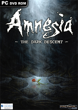 4. Frictional Games (Sweden)
Frictional Games specializes in thought-provoking psychological horror games. After creating the moderately successful Penumbra series in 2007, Frictional finally had a cult hit phenomenon last year with Amnesia: The Dark Descent. It's a survival horror game in the truest sense of the term--the player has no weapons. They must simply navigate a dark castle without going insane. The monsters you can see are not nearly as scary as the ones you can't see. Amnesia's popularity has led to hundreds of YouTube videos of people playing the game and freaking out.
 3. EA DICE (Sweden)
EA DICE is best known for two completely different experiences. The first is 2002's Battlefield 1942, considered by many to be a milestone for the online first-person shooter genre. It launched the whole Battlefield franchise, which is planning to go head-to-head against Infinity Ward's immensely popular Call of Duty series for online FPS domination this year with Battlefield 3. EA DICE's most ambitious title is the parkour masterpiece Mirror's Edge in 2008, with minimalist visuals and a revolutionary free-running control scheme. And the new Spider-Man trailer seems to have ripped Mirror's Edge off completely.
 2. Remedy Entertainment (Finland)
The Matrix may have created the "bullet time" action movie effect, but Remedy's 2001 crime classic Max Payne was the first video game to fully realize bullet time as a game mechanic. An homage to the films of John Woo with a film noir art style, Max Payne opened with a bang: you come home and get to see your wife and daughter murdered. Instead of traditional cutscenes, Max Payne used graphic novel-style panels with voice-overs for exposition.
Remedy then went on to create Alan Wake last year, a Twin Peaks-inspired adventure about a novelist stuck in a town where the shit hits the psychological fan.
 1. Mojang (Sweden)
Mojang has only created one game as a company, but it's perhaps the most influential and groundbreaking on this list: Minecraft. With a beta released in 2009, it's gone from cult hit to mainstream success story before the "finalized" version even becomes available this November.
Minecraft approaches the "games as art" argument in a similar way to The Sims: what is a game? Does a game need to have a goal or a way to "win" to be a game? In Minecraft, players must figure this all out for themselves. It's a cornucopia of user-generated content.
Having lived in Denmark, I know Scandinavians argue over what the definition of "Scandinavia" is, so I'll try to simply say "the Nordic countries," even if it doesn't roll off the tongue as easily.
In a part of Europe known for minimalism and bleak landscapes, their games reflect a more pensive, thoughtful nature than their American and Japanese counterparts.
 10. CCP Games (Iceland)
CCP is Iceland's only developer on this list, but with a nation of only 318,000 people (half the size of Washington, D.C.), it's understandable. They're best known for creating the massively-multiplayer science fiction game EVE Online in 2003--one of the only MMOs that's been able to sustain a consistent userbase in a market virtually monopolized by Blizzard's World of Warcraft. CCP is currently working on Dust 514, a massively multiplayer first-person shooter set in the EVE Online universe; players in the two games will be able to interact with one another.
 9. Rovio Mobile (Finland)
I couldn't do a list of Nordic game developers without mentioning Rovio, the team behind the 2009 casual gaming colossus Angry Birds. They've created their fair share of mediocre iPhone games, and Angry Birds itself has inspired dozens of rip-offs by other companies, but its place cannot be denied in the Nordic gaming pantheon. Perhaps it's the intriguing name, perhaps it's the story of "fat birds launched at pigs," but Angry Birds is one of Finland's most important exports.
 8. IO Interactive (Denmark)
 IO Interactive is most widely known for its Hitman franchise, started in 2000: one of the most creative takes on the stealth genre, where the player has the titular job and must disguise himself and stay below the radar to accomplish missions. IO is also famous for the controversial Kane & Lynch in 2007, but their best title is perhaps their most overlooked: 2003's Freedom Fighters, a game about a Soviet invasion of America. Side note: famed Danish game music composer Jesper Kyd had his mainstream breakthrough writing the soundtracks for IO's work.
 7. Nifflas (Sweden)
Nicklas Nygren, better known as "Nifflas," is different from the rest of the developers on this list. He's never released a commercial game. He's never had mainstream success. But he's created some of the most important independent games available on the internet. His series Knytt is about a character from a famous 1960 Swedish-Finnish novel, Vem ska trösta knyttet? (Who Will Comfort Knytt?). Nifflas also created Within a Deep Forest, a minimalist platformer set in a post-apocalyptic world.
 6. Playdead (Denmark)
 Playdead was started in 2006 by former IO Interactive employees so they could have a bit more artistic freedom to create their first game, last year's dark puzzle-platformer Limbo. The game was a stark, minimalist departure from the action-packed norm at IO, and a premium example for the classic "games as art" argument. The protagonist has no name, and players must piece together the narrative on their own. Playdead is currently working on their second title.
 5. Funcom (Norway)
 Norway lags behind its Nordic brethren when it comes to game design, but Funcom continues to carry the torch. They were put on the map with The Longest Journey (Norwegian: Den lengste reisen) in 1999. It was a swan song for the PC adventure genre, with an enigmatic, cerebral storyline and complex characters. Funcom then turned its focus to MMOs with Anarchy Online in 2001 and Age of Conan: Hyborian Adventures in 2008. They're currently working on a post-modern MMO called The Secret World, which could be a breath of fresh air in today's online RPG landscape.
 4. Frictional Games (Sweden)
Frictional Games specializes in thought-provoking psychological horror games. After creating the moderately successful Penumbra series in 2007, Frictional finally had a cult hit phenomenon last year with Amnesia: The Dark Descent. It's a survival horror game in the truest sense of the term--the player has no weapons. They must simply navigate a dark castle without going insane. The monsters you can see are not nearly as scary as the ones you can't see. Amnesia's popularity has led to hundreds of YouTube videos of people playing the game and freaking out.
 3. EA DICE (Sweden)
EA DICE is best known for two completely different experiences. The first is 2002's Battlefield 1942, considered by many to be a milestone for the online first-person shooter genre. It launched the whole Battlefield franchise, which is planning to go head-to-head against Infinity Ward's immensely popular Call of Duty series for online FPS domination this year with Battlefield 3. EA DICE's most ambitious title is the parkour masterpiece Mirror's Edge in 2008, with minimalist visuals and a revolutionary free-running control scheme. And the new Spider-Man trailer seems to have ripped Mirror's Edge off completely.
 2. Remedy Entertainment (Finland)
The Matrix may have created the "bullet time" action movie effect, but Remedy's 2001 crime classic Max Payne was the first video game to fully realize bullet time as a game mechanic. An homage to the films of John Woo with a film noir art style, Max Payne opened with a bang: you come home and get to see your wife and daughter murdered. Instead of traditional cutscenes, Max Payne used graphic novel-style panels with voice-overs for exposition.
Remedy then went on to create Alan Wake last year, a Twin Peaks-inspired adventure about a novelist stuck in a town where the shit hits the psychological fan.
 1. Mojang (Sweden)
Mojang has only created one game as a company, but it's perhaps the most influential and groundbreaking on this list: Minecraft. With a beta released in 2009, it's gone from cult hit to mainstream success story before the "finalized" version even becomes available this November.
Minecraft approaches the "games as art" argument in a similar way to The Sims: what is a game? Does a game need to have a goal or a way to "win" to be a game? In Minecraft, players must figure this all out for themselves. It's a cornucopia of user-generated content.
Monday, July 18, 2011
How to make a compelling firefighter video game
In my quest to validate games as an art form, I'm constantly hit with the fact that most video games are combat-based. Shooter games, strategy games... even Super Mario Bros. involves violence. There are plenty of debates as to why this is. Regardless, it makes non-combat games always stand out to me.
.png) But we've perfected this first-person shooter format to a science! There must be something we can do with it that doesn't involve shooting people. So it hit me: we need to see a classic firefighter video game. It's a simple concept. Use the first-person perspective of an FPS, but instead of killing people, you're putting out fires and saving people! Sounds exciting!
But we've perfected this first-person shooter format to a science! There must be something we can do with it that doesn't involve shooting people. So it hit me: we need to see a classic firefighter video game. It's a simple concept. Use the first-person perspective of an FPS, but instead of killing people, you're putting out fires and saving people! Sounds exciting!
So I took a quick Google gander at the handful of firefighting games ever released on any platform. Firefighting, along with deer hunting and bass fishing, seems to be represented in video games solely by bargain-bin casual titles. But I found a couple of "real" ones.
The first is Burning Rangers, a strange firefighting game for the dying Sega Saturn in 1998, developed by Sonic Team (who made, you know... Sonic). The game is set in a futuristic world where fires are the only real hazard left to humanity, so the government has set up an elite team of super firefighters. It's not exactly a realistic simulation--you wear a rocket-powered space suit and shoot water out of a laser gun. Although this game is actually highly regarded by Saturn enthusiasts, it's not exactly what I'm looking for in a firefighting game.
 The next is Firefighter F.D. 18, developed by Konami and released in 2004 for the PlayStation 2. It's a third-person action game that tries to recreate realistic firefighting situations a bit more closely than Burning Rangers. It's a classic Konami formula of the era, even including "boss" fires at the end of levels. An interesting issue this game ignores: the player is not restricted in movement at all, so the fire hose he's holding seems to go on and on forever. The longest fire hose of all time. How could a game more accurately portray fire hose lengths, without constricting the player too much?
 The last game I looked at is, in fact, a bargain bin casual game published by Conspiracy Entertainment, famous for such masterpieces as Ninjabread Man and Action Girlz Racing. This one is entitled Real Heroes: Firefighter and was released for the Wii in 2009. It takes the first person perspective I had been thinking about for my own theoretical game, with mediocre results. One of the main issues inherent with the firefighting genre is that your main enemy through the whole game is just one thing: fire. How do you keep fire interesting? This game consists of linear levels and a few civilians to rescue.
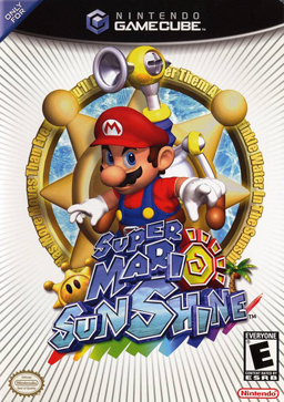 An honorable mention goes to the most successful implementation of a water-shooting device in video games: Nintendo's own Super Mario Sunshine, released for the GameCube in 2002. It's the most-maligned title in the Mario franchise, but the eponymous hero's Flash Liquidizer Ultra Dousing Device (FLUDD) works brilliantly in the game to clean up graffiti and muddy messes. Clearly, this game mechanic can be achieved. It simply needs to be used on fire.
So how can we learn from these mistakes?
First and foremost, fire is boring. Both gameplay-wise and art-wise, it gets repetitive. It's hard to program "creative" AI for something without a brain, but a game about firefighting has to keep the fires themselves interesting and fun to put out, other than just "walk up to fire, put it out, move on." As for the art, it seems every single firefighting game I looked at had the same color palette: orange, orange, orange, and black. It makes sense since it's fire, but good games have a diverse color range, so you don't feel like you're playing the same level over and over. Plus, modern game technology seems better suited to tackle the complex graphics of fire and water than the spate of PlayStation 2 firefighting games.
 There's a lot of gameplay we can derive from firefighting other than just fighting fires. Saving people in different situations and trying to use your tools to get to trapped civilians adds a whole new element to the gameplay. Something none of these games touched on is the fire engine itself. Fire engines are so much a part of little kids' dreams, and they're ripe for gamification. You could customize and upgrade the fire engine, and drive through traffic and red lights to get to the fire itself. And the fire station could be a nifty "home base" for it all.
But the question remains--how do you keep it interesting for an extended period of time? There needs to be some sort of emotional hook without making it cheesy or melodramatic.
Then it came to me: the final level of the game. It should be September 11.
Imagine the impact. You're playing through this game, having gritty firefighting adventures, and suddenly you're hit with something a bit more heavy. If handled well, it could be incredibly poignant. I would want to avoid any sort of over-patriotism or jingoism in the game. If it's simply about firefighters doing their jobs and then dealing with the events of 9/11, I believe that's something real-life firefighters could identify with.
There would be the same controversy that surrounds Six Days in Fallujah, with many people saying it hits too close to home. Publisher cowardice aside, Six Days in Fallujah is able to handle its subject matter gracefully because the developer, Atomic Games, actually spoke extensively with the Marines involved in the Second Battle of Fallujah; they got the Marines' approval to make the title. This firefighting game would have to do the same, with the New York City Fire Department.
And then we can cross the line from "fun games" to "games as art."
.png) But we've perfected this first-person shooter format to a science! There must be something we can do with it that doesn't involve shooting people. So it hit me: we need to see a classic firefighter video game. It's a simple concept. Use the first-person perspective of an FPS, but instead of killing people, you're putting out fires and saving people! Sounds exciting!
But we've perfected this first-person shooter format to a science! There must be something we can do with it that doesn't involve shooting people. So it hit me: we need to see a classic firefighter video game. It's a simple concept. Use the first-person perspective of an FPS, but instead of killing people, you're putting out fires and saving people! Sounds exciting!So I took a quick Google gander at the handful of firefighting games ever released on any platform. Firefighting, along with deer hunting and bass fishing, seems to be represented in video games solely by bargain-bin casual titles. But I found a couple of "real" ones.
The first is Burning Rangers, a strange firefighting game for the dying Sega Saturn in 1998, developed by Sonic Team (who made, you know... Sonic). The game is set in a futuristic world where fires are the only real hazard left to humanity, so the government has set up an elite team of super firefighters. It's not exactly a realistic simulation--you wear a rocket-powered space suit and shoot water out of a laser gun. Although this game is actually highly regarded by Saturn enthusiasts, it's not exactly what I'm looking for in a firefighting game.
 The next is Firefighter F.D. 18, developed by Konami and released in 2004 for the PlayStation 2. It's a third-person action game that tries to recreate realistic firefighting situations a bit more closely than Burning Rangers. It's a classic Konami formula of the era, even including "boss" fires at the end of levels. An interesting issue this game ignores: the player is not restricted in movement at all, so the fire hose he's holding seems to go on and on forever. The longest fire hose of all time. How could a game more accurately portray fire hose lengths, without constricting the player too much?
 The last game I looked at is, in fact, a bargain bin casual game published by Conspiracy Entertainment, famous for such masterpieces as Ninjabread Man and Action Girlz Racing. This one is entitled Real Heroes: Firefighter and was released for the Wii in 2009. It takes the first person perspective I had been thinking about for my own theoretical game, with mediocre results. One of the main issues inherent with the firefighting genre is that your main enemy through the whole game is just one thing: fire. How do you keep fire interesting? This game consists of linear levels and a few civilians to rescue.
 An honorable mention goes to the most successful implementation of a water-shooting device in video games: Nintendo's own Super Mario Sunshine, released for the GameCube in 2002. It's the most-maligned title in the Mario franchise, but the eponymous hero's Flash Liquidizer Ultra Dousing Device (FLUDD) works brilliantly in the game to clean up graffiti and muddy messes. Clearly, this game mechanic can be achieved. It simply needs to be used on fire.
So how can we learn from these mistakes?
First and foremost, fire is boring. Both gameplay-wise and art-wise, it gets repetitive. It's hard to program "creative" AI for something without a brain, but a game about firefighting has to keep the fires themselves interesting and fun to put out, other than just "walk up to fire, put it out, move on." As for the art, it seems every single firefighting game I looked at had the same color palette: orange, orange, orange, and black. It makes sense since it's fire, but good games have a diverse color range, so you don't feel like you're playing the same level over and over. Plus, modern game technology seems better suited to tackle the complex graphics of fire and water than the spate of PlayStation 2 firefighting games.
 There's a lot of gameplay we can derive from firefighting other than just fighting fires. Saving people in different situations and trying to use your tools to get to trapped civilians adds a whole new element to the gameplay. Something none of these games touched on is the fire engine itself. Fire engines are so much a part of little kids' dreams, and they're ripe for gamification. You could customize and upgrade the fire engine, and drive through traffic and red lights to get to the fire itself. And the fire station could be a nifty "home base" for it all.
But the question remains--how do you keep it interesting for an extended period of time? There needs to be some sort of emotional hook without making it cheesy or melodramatic.
Then it came to me: the final level of the game. It should be September 11.
Imagine the impact. You're playing through this game, having gritty firefighting adventures, and suddenly you're hit with something a bit more heavy. If handled well, it could be incredibly poignant. I would want to avoid any sort of over-patriotism or jingoism in the game. If it's simply about firefighters doing their jobs and then dealing with the events of 9/11, I believe that's something real-life firefighters could identify with.
There would be the same controversy that surrounds Six Days in Fallujah, with many people saying it hits too close to home. Publisher cowardice aside, Six Days in Fallujah is able to handle its subject matter gracefully because the developer, Atomic Games, actually spoke extensively with the Marines involved in the Second Battle of Fallujah; they got the Marines' approval to make the title. This firefighting game would have to do the same, with the New York City Fire Department.
And then we can cross the line from "fun games" to "games as art."
Labels:
game ideas
Friday, July 15, 2011
Top Ten: Canadian game developers
In the game industry, we often think of Japan and the United States as the only relevant nations. And yes, the vast majority of games today do come from these two countries. But like Neil Young and Jim Carrey, many people we assume are American are, in fact, Canadian. Our neighbors to the north have contributed to video games in a huge way--they're the #3 biggest game manufacturer in the world. So let's take a gander at the top ten Canadian video game developers. Looking at the games on this list, it seems Canadians have a passion for strategy games. What does that say about them as a gaming nation?
10. United Front Games
A new developer created from former employees of EA, Rockstar, Radical Entertainment, and Volition, Inc. Developed the user-creation-driven kart racing ModNation Racers in 2010.
 9. Rockstar Vancouver
Began life as Barking Dog Studios making extra content for other games, but went on to become a part of British giant Rockstar Games and create the underrated open-world boarding school game Bully in 2006. Currently working on the upcoming sequel to Max Payne.
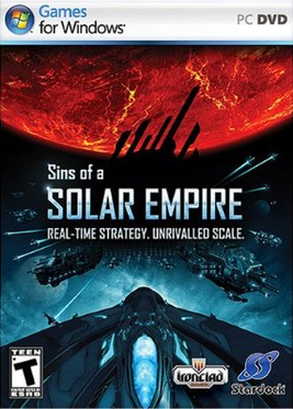 8. Ironclad Games
Consists of former Barking Dog Studios employees. Developed the landmark 2008 science fiction strategy title Sins of a Solar Empire.
 7. Silicon Knights
On this list primarily because of their masterpiece psychological horror work, 2002's Eternal Darkness: Sanity's Requiem. Fittingly, afterwards they went crazy and created the titanic disappointment Too Human in 2008.
 6. Relic Entertainment
All about strategy games, largely in the spacey vein. Created the 1999 Homeworld and Warhammer 40,000: Dawn of War in 2004. as well as the crown jewel of World War II strategy games in 2006, Company of Heroes.
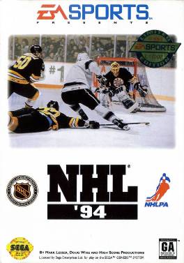 5. EA Canada
The biggest developer for the biggest American third-party publisher is based in Burnaby, British Columbia. A major player in the sports game genre. Created perhaps the best sports game of all time, NHL '94, and continue to perfect the art of hockey with the NHL series. The industry standard for soccer, too, with FIFA. Invented the snowboarding genre with SSX. Dethroned Tony Hawk's skateboarding monopoly with Skate (as EA Black Box).
 4. Ubisoft Montréal
The most successful French-Canadian developer. Fittingly, a branch of French-French publishing giant Ubisoft. Brought stealth gaming to the masses with Tom Clancy's Splinter Cell. Reinvented the Prince of Persia franchise for the modern era, then created a spiritual 3D platforming successor with Assassin's Creed.
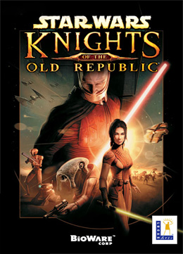 3. BioWare
Name a major Western RPG with some sort of moral choice system, and there's a large chance BioWare developed it. Defined early 2000s RPGs with Baldur's Gate and the Neverwinter Nights reboot. Made what's widely considered the "greatest Star Wars game ever," Knights of the Old Republic. Developed the commercial smash hits Mass Effect and Dragon Age, as well as the vastly overlooked ancient China adventure Jade Empire.
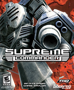 2. Chris Taylor
The biggest name in sci-fi strategy games, with a few dungeon crawlers to boot. Worked with Cavedog Entertainment and later his own company, Gas Powered Games; both headquartered in the United States. Conceived Total Annihilation in 1997, the first real-time strategy game with 3D graphics. Went on to make his mark on the dungeon crawling genre with 2002's Dungeon Siege, then went back to his native science fiction strategy with Supreme Commander in 2007.
 1. Sid Meier
Really doesn't need an intro. One of gaming's first iconic auteurs. Worked with MicroProse and later his own company, Firaxis Games; both headquartered in the United States. Sense a trend in Canadian video game figures? Created landmark pirate sim creatively titled Pirates! in 1987. Revolutionized strategy gaming with Civilization in 1991, followed by futuristic opus Alpha Centauri in 1999.
10. United Front Games
A new developer created from former employees of EA, Rockstar, Radical Entertainment, and Volition, Inc. Developed the user-creation-driven kart racing ModNation Racers in 2010.
 9. Rockstar Vancouver
Began life as Barking Dog Studios making extra content for other games, but went on to become a part of British giant Rockstar Games and create the underrated open-world boarding school game Bully in 2006. Currently working on the upcoming sequel to Max Payne.
Consists of former Barking Dog Studios employees. Developed the landmark 2008 science fiction strategy title Sins of a Solar Empire.
 7. Silicon Knights
On this list primarily because of their masterpiece psychological horror work, 2002's Eternal Darkness: Sanity's Requiem. Fittingly, afterwards they went crazy and created the titanic disappointment Too Human in 2008.
 6. Relic Entertainment
All about strategy games, largely in the spacey vein. Created the 1999 Homeworld and Warhammer 40,000: Dawn of War in 2004. as well as the crown jewel of World War II strategy games in 2006, Company of Heroes.
 5. EA Canada
The biggest developer for the biggest American third-party publisher is based in Burnaby, British Columbia. A major player in the sports game genre. Created perhaps the best sports game of all time, NHL '94, and continue to perfect the art of hockey with the NHL series. The industry standard for soccer, too, with FIFA. Invented the snowboarding genre with SSX. Dethroned Tony Hawk's skateboarding monopoly with Skate (as EA Black Box).
 4. Ubisoft Montréal
The most successful French-Canadian developer. Fittingly, a branch of French-French publishing giant Ubisoft. Brought stealth gaming to the masses with Tom Clancy's Splinter Cell. Reinvented the Prince of Persia franchise for the modern era, then created a spiritual 3D platforming successor with Assassin's Creed.
 3. BioWare
Name a major Western RPG with some sort of moral choice system, and there's a large chance BioWare developed it. Defined early 2000s RPGs with Baldur's Gate and the Neverwinter Nights reboot. Made what's widely considered the "greatest Star Wars game ever," Knights of the Old Republic. Developed the commercial smash hits Mass Effect and Dragon Age, as well as the vastly overlooked ancient China adventure Jade Empire.
 2. Chris Taylor
The biggest name in sci-fi strategy games, with a few dungeon crawlers to boot. Worked with Cavedog Entertainment and later his own company, Gas Powered Games; both headquartered in the United States. Conceived Total Annihilation in 1997, the first real-time strategy game with 3D graphics. Went on to make his mark on the dungeon crawling genre with 2002's Dungeon Siege, then went back to his native science fiction strategy with Supreme Commander in 2007.
 1. Sid Meier
Really doesn't need an intro. One of gaming's first iconic auteurs. Worked with MicroProse and later his own company, Firaxis Games; both headquartered in the United States. Sense a trend in Canadian video game figures? Created landmark pirate sim creatively titled Pirates! in 1987. Revolutionized strategy gaming with Civilization in 1991, followed by futuristic opus Alpha Centauri in 1999.
Subscribe to:
Comments (Atom)


_Irish_Frankenstein.jpg)
