Sunday, April 2, 2017

2017 MLS jersey rankings

It's been a long time since I've done this. After the dark ages of the '90s and early '00s, it seems like sports teams in general are favoring cleaner, more classic looks these days... but are they TOO classy? They're North American soccer teams, after all, not centuries-old vaunted European globetrotting franchises. Some would argue MLS clubs have gone from one extreme (take a gander at these inaugural 1996 MLS jerseys) to the other, trying too hard to feel like some established cultural pillar that they're not. You gotta keep a LITTLE fun in there, right?

But I digress. To be fair, even the weakest of these are fairly well designed, so kudos to Major League Soccer for improving over the years. Without further ado, here's my ranking of all 22 MLS primary jerseys for the 2017 season, from worst to best:

22. New England Revolution

New England is a founding member of MLS, and for its entire 21-year history, it's struggled with an awful brand identity. A terrible team name, an abysmal team logo, a bland color scheme taken straight from the New England Patriots, and a long history of ugly jerseys. The shirt sponsor United Healthcare can't seem to pick a logo either, so they've got THREE brandings on here: The UHC initials, the United Healthcare wordmark, and their logo. Can't they just pick one?

This season's look is doing the most it can with the cards it's been dealt (and minimizes the amount of gray in the shirt, which was more heavily featured in older uniforms), but I can't help but feel like this team is overdue for a total brand makeover. It's not the '90s anymore! At least the stripe down the middle of the shirt with the chevron in the negative space is unique? Maybe the only good part of this whole thing.

21. FC Dallas

In previous seasons, FC Dallas has worn some really unique red and white horizontal stripes, but they get a bit muddied up in the new shirt. What are these stripes even trying to do now? And it bothers me that they don't go all the way around the shirt--the side panels and sleeves are blank red.

The "LH" patch on the shoulder is an homage to the team's late owner Lamar Hunt, which is alright, I guess. I would normally take issue with the cheesy American flag in the bottom corner of the shirt, but it's Texas, so of course they're gonna be hyper-patriotic. I'm okay with it!

20. Sporting Kansas City

Sporting KC used to have such a good thing going, but they got usurped in the "sky blue jersey" department by New York City FC down below, and they had to add that dumb collar. It's tough to make sky blue work in a jersey, since it's such an understated color--adding those little pale blue pinstripes don't make it look any better. I'm not opposed to the concept of collars on soccer jerseys, but this isn't some Portuguese team founded in the 1800s as much as the team name would like you to think so. And the team crest is such a blahhhhh, this all just looks like a preppy polo shirt.

I lived in Kansas City for a couple years (the real one in Missouri, not the fake one in Kansas) and went to see them anytime DC United was in town--SKC has passionate fans and their stadium is top-notch... even if it's on the *~Kansas~* side.

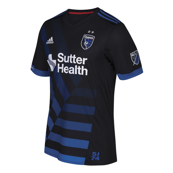
19. San Jose Earthquakes

I almost love this. This shirt isn't dead last because at least it marches to the tune of its own drum. This is almost embracing Major League Soccer's goofy '90s heritage in a way that still looks good... but it doesn't.

It stands out, but those asymmetrical gradient stripes are uuuugly. Maybe if it were a lighter shade of blue it'd look better? The team has played with shades approaching teal in the past, and those looked great. The whole shirt looks a bit too dark for a team playing in California of all places. Not to mention that in the Year of Our Lord 2017, the San Jose Earthquakes is a terrible team name that 13-year-old kids don't think is cool anymore.

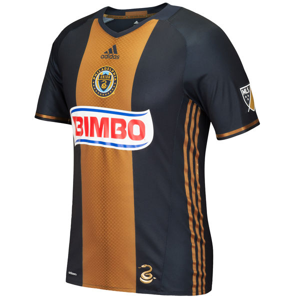
18. Philadelphia Union

The current Philly uniform sticks pretty closely to the identity they've been rocking as long as they've been in MLS, since 2010. They get points for creativity--this is a Mexican soccer-inspired look through and through, from the team crest in the center of the shirt rather than on the left breast, to the Bimbo sponsorship. I wish the Bimbo logo had colors that matched the rest of the jersey, but it's kind of charming in its Mexican soccer throwback. I know the Mexican bread brand Bimbo draws jeers in the US, but it's the world's largest baking company, so it's whateva.

My main issue with Philadelphia's look is that their color scheme just doesn't inspire much passion. The team logo with the snake is pretty great, but navy blue is tough to pull off as an interesting primary color--maybe they'd do better to include more of the gold. And the fact that the Adidas logo is also centered on the shirt gives it a bit too much of a traffic light vibe--I wish it were off to the side.

17. Orlando City

This team has SUCH a great color scheme, but they had to design the least remarkable shirt possible for it. So much wasted potential. The textured look on the solid purple jersey is nice, but I don't have any other positive words for this. Too matchy-matchy. Not enough contrast on the team crest to make it legible. Can you see the lion's head on the badge at this size? Neither can I.

Why is there an old-fashioned collar on this shirt?! It would work great for some teams, but not a two-year-old team from ORLANDO, FLORIDA. This team should have a fun, vibrant shirt! Not these authoritarian-looking gold Adidas stripes on the shoulders.

16. Chicago Fire

A plain red jersey. Not bad, not great, but it passes the test. You can see the Chicago flag embossed really faintly in the bottom corner of the shirt--but if you're gonna make it so subtle, why put it there at all?

The white stripe across the chest of the shirt sets it apart from other MLS jerseys (and they've had it since the league's inception in 1996), but is anyone really dying to wear this shirt? The sponsor, paint company Valspar, is alright but not nearly as fun as their previous shirt sponsor: oatmeal company Quaker!

15. Real Salt Lake

Real Salt Lake has a great color scheme--ironic that the colors are taken from Spanish giants Barcelona, while their name is taken from Barça's arch-rival Real Madrid--but they don't take advantage of the colors enough with this jersey. They could be incorporating the blue and the gold more, but instead, it's mostly a plain (but pleasant) red jersey.

The sponsor logo could've worked on this shirt if they made it gold, but the fact that it's white makes this yet another forgettable shirt. I wish the shade of red used for this uniform weren't so bright--in the past they've used darker maroons that feel way more classy. Last of all, what's that American flag doing in the corner? I gave Dallas the pass for this because it's Dallas, but Salt Lake City? Ehhhh...

14. Colorado Rapids

Going with the West Ham / Aston Villa style maroon shirt with sky blue sleeves--not that special in the soccer world, but it's popular because it's a great color scheme and it's unique among North American teams. PLUS it matches the colors of Colorado's other sports teams, which is a nice little bonus.

The Colorado flag on the jock tag (did you know that's what that thing is called on sports jerseys?) is a welcome addition--you know I love flags--but I wish it were incorporated in a more interesting way. This is just a "pretty decent" jersey for a "pretty decent" team.

13. Toronto FC

This is a well-designed shirt, with the nifty stripes down the sides that continue onto the sleeves and the red-on-red glossy/matte red finish on the main body of the jersey. But dark gray is too innocuous of a secondary color, and why does it have to say "The Reds" on the right sleeve cuff? If you have to proclaim your own nickname, maybe it's not as iconic a nickname as you think it is.

Not to mention the fact that Toronto's sponsor is the Bank of Montreal, the city of their arch-rivals. Whyyyy?

12. New York Red Bulls

They nearly ruined a great shirt. I've already moved on from the fact that this team is named after an energy drink--Red Bull sponsors tons of sports teams, including the much bigger Red Bull Salzburg in Austria. The Red Bull logo is actually a pretty great design element on the shirt, even if it's a bit redundant to have it on the team crest as well as on the chest as a sponsor logo. RBNY has rocked the white with red detailing well lately... until they had to ruin it with this '90s-ass red laser thing on the corner of the shirt this year.

Maybe it's really an embrace of MLS' heritage as a product of the '90s? Maybe it'll grow on me? My gut reaction is "it's terrible," though.

I've always had a tough relationship with the "names on the lower back" thing that some sports teams do, but at least it's a bit different.

11. Houston Dynamo

The solid block creamsicle primary color isn't my fave, but at least it's distinctive. The tiny little horizontal stripes do a nice job of breaking up the block of color (although I wish the stripes went all the way around the shirt), and the wide white cuffs on the sleeves help a bit too.

Somehow the Texas flag on the jock tag here doesn't bother me nearly as much as the Colorado flag on the Rapids jersey--maybe because the rest of the shirt is less busy than the Rapids shirt?

10. Columbus Crew

This is a classy-ass jersey reminiscent of Borussia Dortmund, but not so much that it feels like a ripoff. Columbus has always toyed with how much black to show on their jerseys vs. the amount of yellow, and I think they hit a good balance here--the thick black cuffs on the sleeves are key. The true highlight of this shirt, though, are those taxicab checkerboards up the sides! Unnnnffff.

Columbus gets a minus, though, for wearing yellow shorts with these yellow shirts--way too matchy-matchy, especially for such a gaudy color. They should've gone with black shorts to compliment this great yellow shirt.

9. Atlanta United

One of the two new MLS clubs this year, this is a pretty solid look overall. The red and black with gold echo the NFL's Atlanta Falcons and the NBA's Atlanta Hawks--I always give points for color scheme consistency across a city's sports teams. Atlanta seems to often pick these colors to represent the burning of the city during the Civil War. The simple, circular "A" crest is meant to evoke the city's Olympic history, hosting the Summer Games in 1996.

The vertical stripes are a good look that's unique in MLS, and the gold Adidas stripes on the shoulders are classy (although a bit too German for my tastes). The sponsor, American Family Insurance, is a bit ehhhh, but at least its logo is gold to match the rest of the shirt. Overall, a well-executed debut jersey, although nothing here really wows me.

8. Minnesota United

The second new team in the league this year, Minnesota is trying to stand out a bit. And they get a lot right: the color scheme stands alone not just among MLS clubs, but in sports in general. The crest is well-designed, the diagonal stripe is unique (the only other American team to use it is LA), and the sponsor is pretty perfect--Target is one of the most widely-recognized local Minnesota businesses, even if it makes players look kinda like walking targets.

There's just something a little off, though. Gray and light blue are great colors, but they're tough to work together. Contrast will always be an issue, and because the team crest doesn't have a black outline around it, it sort of fades into the blue stripe... you can barely even see the North Star above the main body of the logo. And unfortunately, the gray primary color just ends up looking a bit too much like a practice jersey--I'm usually all about minimalism, but maybe this shirt needs a few more details to stand out? The little collar is a nice touch, and I'd like to see more stuff like that. Overall, this look has great potential, and I'm excited to see where Minnesota's jersey designs go from here.

7. Montreal Impact

This jersey is on the verge of being a classic. I'm all about civic pride and flag incorporation, and Montreal does it right: the blue and white come from the provincial flag of Quebec, and the symbols on the jock tag come straight from the city flag of Montreal: a Fleur-de-lys for Montreal's French heritage, a rose for its English heritage, a thistle for its Scottish heritage, and a shamrock for its Irish heritage. The local Bank of Montreal sponsor is a plus as well.

I just want to see this look simplified even more: there's a bit too much extraneous piping, and the shirt has the problem many striped jerseys do, where the stripes only exist on about 60% of the shirt: they're absent from the sleeves or the back where the jersey number goes.

6. New York City FC

It's difficult to judge this jersey on its own merits, since it borrows almost entirely from its older sibling club Manchester City. It's actually a slightly better uniform than Man City's weird speed cycling look this season, but all the design elements are the same. With that said, it's a great design! Classy colors, logo, and minimalist aesthetic.

Being the Big Apple's second MLS club after the New York Red Bulls, I love how petty NYCFC are by rubbing in your face that they actually play in New York City (the Red Bulls play in New Jersey). The NYC city flag on the jock tag is a nice touch, aside from the fact that no one cares about the NYC city flag--but it's a nifty subtle touch to continue the orange from the flag onto the tiny stripes on the sleeve cuffs.


5. D.C. United

Okay, maybe I'm a little biased here. Like Columbus with their colors, DCU has always played around with how much red to show on their shirt vs. the amount of black, and usually I'm in favor of as much red as possible. But the red showing up mainly on the Adidas stripes on the sides (in addition to in the team crest) is a stroke of genius--it's enough to make me a believer in the black. The thin red/white cuffs on the sleeves and the subtle black-on-black matte/glossy striping round out the A+ look, and I love the "TAXATION WITHOUT REPRESENTATION" on the inside of the neck.

I've only got two complaints: first is the shirt sponsor, Leidos. Replacing our super classy longtime sponsor Volkswagen, Leidos is a fucking shady defense contractor, and makes me feel like I'm supporting a corporate killing machine.

My second complaint is the DC map with the DC flag in it on the jock tag. I know what you're saying... "Jake, your city pride is through the roof, you've even got the DC flag tattooed on you! You should love this!" But I think it's a little overkill in this jersey. Hear me out: the DC flag is already represented in the body of the eagle on the team logo, so it's redundant to put the flag on the jock tag as well. And I'm never a fan of "flag in a map" imagery--if the flag is supposed to represent the city, why do we also need a map of the city? Again, it's redundant. If they wanted to do a cool local touch on the bottom of the jersey, they should've just featured Taxation Without Representation more prominently--or maybe a "51" to support statehood as the 51st state?

4. Los Angeles Galaxy

This is nearly a perfect shirt. The diagonal blue and gold stripes are simple yet distinctive, and stand out among other MLS clubs. The color scheme stands on its own. The blue Adidas stripes are classy. BUT: two small things.

First, I wish the stripe went all the way up the front of the shirt. The fact that it stops at the seam around the collarbone is real weird.

Second, and more egregious: that dumb jock tag. Most people are never even going to see it. But "THIS IS LA" feels like your dad trying to be cool. "LA" already appears in big letters on the team crest. Why you gotta ruin it??

3. Seattle Sounders

Seattle's got some of the most insufferable fans, but they probably encapsulate Major League Soccer better than anyone else. Their games are packed, and they hit the perfect balance of embracing the weird '90s heritage of American soccer while keeping a clean, classy look.

That neon green that's a bit obnoxious (in a good way) and connects to Seattle's other sports teams; those blue sleeves that keep the shirt from looking boring and the team crest that's pretty close to perfect. And unmatched sponsor integration(?!?!?)--not only is Xbox a local Washington state brand, but its wordmark is simple and to the point, and the colors match perfectly! Baba booey, there's not much else you could ask for.

2. Portland Timbers

It pains me to rank Portland so high. As long as they've been in the league, they've consistently always worn some of the best jerseys in North America. The pure simplicity is staggering: a minimalist crest that doesn't even feature the team wordmark. A simple sponsor logo that matches the color of the rest of the shirt (even if it's a little strange to see Alaska advertised on a shirt for a team from Oregon). Little flourishes like the buttoned neck, the subtle green-on-green striping, and Portland city flag on the jock tag, that all make the uniform stand out without feeling too gimmicky.

This jersey is similar in many ways to Orlando's, so what makes this one so much better? I think it's a few things. The sponsor logo is incorporated way better. Orlando has a decent team crest, but it's a bit too busy for the lack of contrast in the colors, so you can't really identify it from afar while Portland's axe is identifiable immediately. Most intangibly, I think this shirt fits the quiet, wooded city of Portland better, while sunny Orlando deserves a brighter look than they get. Context matters!

1. Vancouver Whitecaps

WHAAAAAA the Pacific Northwest with a 1-2-3 knockout punch here on this list! Everything I said about Seattle mixing '90s weird North American soccer heritage with a refined modern look applies to this shirt times ten. I'm sure some people HATE the Rocko's Modern Life triangles on this jersey, but I think they're perf. Without the triangles, this is a clean, classic looking jersey with a good crest, a well-integrated sponsor logo, and a fantastic color scheme that's able to make white work as a primary color.

WITH the triangles, this is... THE RAIN JERSEY. Seriously, click that link--Vancouver made a whole video on why the triangles on the shirt represent the rain. Not many cities can own rain as a point of pride, but Vancouver makes it work. It's wonderful. The only downside of this entire jersey is that the rain triangles don't continue onto the back of the shirt.

There you have it. Tell me how 100% correct I am in the comments?!?!?

Thursday, October 30, 2014

Let There Be Fight: A Critical Analysis of Rob Liefeld's Prophet #1

I've read many stories containing characters created by creative powerhouse Rob Liefeld; however his early creator-owned work is a blind spot of my comic knowledge.  Oddly enough the 2012 relaunch of Liefeld's Prophet is my favorite ongoing series.  Now I seek to learn the origins of this stellar comic through a continuing series of posts analyzing Rob Liefeld's Prophet.  Last week Prophet's genesis was examined in Youngblood #2.    This week I crack open my second Extreme Studios comic from those halcyon 90's and the first issue of the Prophet solo series.    Remember how I promised to be more concise?  I lied.

Despite Rob Liefeld being a monolithic figure it's important to remember that he had collaborators and give them due credit.  Rob shares creative duties on this issue as he is only responsible for being the creator, writer, and doing layouts as Dan Panosian (pronounced Pan-Ocean) takes up penciling and inking.

Monday, October 20, 2014

In the Bloodginning: A Critical Analysis of Rob Liefeld's Youngblood #2

Prophet by Brandon Graham, Simon Roy, Giannis Milonogiannis, Farel Dalrymple, Joseph Bergin III, Ed Brisson, Malachi Ward, Matt Sheean, and friends is easily my favorite comic on the stands.  Going into the series I was aware that it was a relaunch of one of Rob Liefeld’s old Extreme Studios’ property but lacked any knowledge on Prophet’s history beyond that.  Now, as Prophet prepares to begin a climactic chapter with Earth War, I find myself curious about the origins of this comic that I am so fond of.  Unfortunately, I missed the boat on Extreme Studios and all the other early Image comics the first time around.  Fortunately, this means I can read peak 90’s comics like the entire run of Prophet pre-2012 relaunch with virgin eyes and chronicle such an experience.  My mission statement for this continuing series of posts on Prophet is to do close readings and critical analysis of each old issue all the while trying to construct a map of how these comics from the decade of Extreme connect to the Prophet of today.  More than likely though, this pseudo-academic exercise will devolve into me just pointing out the raddest parts of the comics.


Monday, May 5, 2014

Ranking every James Bond film


I feel like a spy. It’s ten to five in the morning, I am sitting in the desolate departure lounge of Glasgow Airport, and I am wearing my navy blue herringbone coat--a stereotypically British knee length spy coat. I am waiting for my flight that will take me soaring into the arms of my loving girlfriend in Belfast Airport, and from there we’ll drive to her family home, where I have been cordially invited for Christmas… The butterflies in my stomach are erupting with excitement, and my mind is whizzing round and round. I feel like a child again, but instead of running around pointing my fingers at random people whilst singing the Bond theme, I try to sit like Bond, Palmer, or Smily would have, looking cool, calm, and collected, and decide that a real spy would get on with his mission…

The problem is, am I safe to begin here? Are the fat elderly couple next to me really an old fat couple, or are they KGB? CIA maybe? Who knows, but after a look around I decide I can begin. I really couldn’t be a spy, though, as I can't wipe the huge ear to ear smile from my face.
I slowly and quietly pull out my laptop, opening it with an attempted cool flick that ends terribly. I open up the word processor, look around both of my shoulders, and then begin my mission. I have been asked by my senior officer… okay my editor, Jake, to write a best Bond films list. This mission is going to be tough, but then again, I have a cup of tea and the Guardian newspaper next to me; I am doing this for Queen and Country. 

I am going to start with the worst Bond film, (leaving out the two spin off films, Never Say Never, and the original Casino Royale) that way I can build up the suspense, like a proper spy film does, as I draw closer to the best Bond film.

23. Moonraker
Moonraker is by far the worst Bond film ever made, but then again, all of the Roger Moore era films are. This motion picture, however, quite frankly just takes the biscuit. Not only was Moore too old, too nice, and just in every way shape and form too wrong to play Bond by the time the film was made; he lumbers along like an unfit, posh neanderthal most of the time. The storyline was just completely absurd! By this point, if you have watched the films chronologically, SPECTRE (SPecial Executive for Counter-intelligence, Terrorism, Revenge, and Extortion) has been destroyed.

They funded all of Bond’s previous enemies, and yet somehow, it appears that a random evil mastermind has made a ton of cash and funded his own space program… UNNOTICED! For goodness sake, he has a bloody space station soaring around up there in space, did no body else see that!? I guess that's American Intelligence for you. The film is full of quirky, childish gadgets, and the attempted double entendres by Moore were just out of character, out of place, and completely cringe worthy. If I were you, I wouldn’t waste the precious time we all have here on earth and skip this, and all of Moore’s Bond films for that matter.

22. A View to a Kill
WHY!!!!???!?!? Just why!? Moore’s final performance as Bond sees him battling yet another crazy American Capitalist, Max Zorin (played by Christopher Walken). Bond's mission in this film was to take out the psychotic microchip manufacturer before he could wipe out all of Silicon Valley… Basically, Bond has to destroy a shite venture capitalist who’s jealous of Silicon Valley’s success. I ask again… WHY!!?!?!?! It was bollocks, complete and utter bollocks, however I will leave you with this: good bye Roger Moore.

21. The Spy Who Loved Me
Never has a Bond film managed to get the essence of Bond so incredibly wrong. Let's face it, Bond has had many staple features throughout the series, from cars to gadgets to double entendres and British pride, with the Bond Girl topping it all off. The Spy Who Loved Me singlehandedly managed to reduce Bond to a smouldering piece of bad acting, ugly cars, and ridiculous gadgets within the space of two hours. Bond, played by Roger Moore yet again, is sent out to destroy a complete maniac, and by maniac I actually mean the absurd and brainless villain Karl Stromberg.

Stromberg plans to start WWIII, have West nuke East, and East nuke West, therefore leaving the planet uninhabitable for thousands of years. That’s a fantastic plan, but where would this genius mastermind live? Well, he plans to build an underwater civilisation and create a utopia, a wonderful dictatorship styled utopia… Hell’s Bells. Again I will advise you to skip this film, that way you won’t have to witness a crap Lotus, a Bond Girl who can’t act for toffee, and more importantly, a storyline that was clearly taken from a sample of one of the screenwriters loo roll scraps.

20. Octopussy
No… Just no. Roger Moore go away, and Albert R. Broccoli bring us a better Bond another day.

19. Die Another Day
Die Another Day was made to celebrate forty years of agent 007, James Bond on screen, and what an abysmal job it did too represent such a brilliant British creation. The best parts of this film were the reintroduction of the Aston Martin as Bond's signature car and Pierce Brosnan’s final performance as Bond. Again Bond had been cast appallingly, Brosnan’s portrayal of 007 was too mature, too nice, and too healthy. He was too suave and too gentle and just didn’t have the roguish behaviour that Bond in the books was all too keen to display at every opportune moment. Luckily for Bond diehards, this was his last film, but Hell’s Horses, why was it the 40th anniversary!?

Die Another Day depicts Bond trying to stop the rebellious son of a North Korean general, Tan-Sun Moon (played by Toby Stephens) from dealing in dirty diamonds… because we all know that the worst thing North Korea are doing is dealing dirty diamonds. As the beginning sequence ends it appears Bond has killed Moon; he hasn’t! And gets captured in the process and imprisoned by the North Koreans. Long story short, he is released, goes on a vengeance mission, and finally comes to the realisation that that Tan-Sun Moon has had his DNA altered to a white man's; enter Toby Stephens as a Korean man, and under his new disguise has built a giant laser to wipe out the demilitarised zone, and unite Korea by force… where is my cyanide pill? We all know the outcome obviously, it’s James Bond, he wins and stops this lunatic's plans for world… well, Korean domination really, and gets the girl. Did I mention the Bond girl was Halle Berry? Oh yes, adding a touch of pure acting class to this otherwise poor film.

18. The Man with the Golden Gun
A trained assassin who goes by the name of Francisco Scaramanga (played by Christopher Lee) uses a golden gun to “remove” people who are a problem. However, he charges a million a shot and therefore is minted. Bond is sent to kill Scaramanger as he has built an incredibly large solar plant that he’ll sell to the highest bidder. This scares the West, as it contains the power to control the Sun's rays that could be used to burn the powerhouses of the Western world to the ground. So off Bond goes to collect another kill. Havoc ensues, Bond kills Scaramanga, and he locks a midget in a suitcase which he then throws overboard. Hilarious but also quite cruel. Moore's second Bond film was just daft because of the sidekick midget and the unimpressive storyline. 

17. The World Is Not Enough 
Brosnan’s second to last film celebrated the turn of the Millennium, it showed off new technologies, a hairdresser's BMW, and a lacklustre performance… again. I will admit though, the story is pretty bloody good. Bond is sent to protect a heiress’ oil pipeline that is under attack from an ex-KGB agent turned terrorist, Renard (played by Robert Carlyle) While in the process of completing his mission, Bond discovers that he is protecting a morally bankrupt daddy's girl who is in league with Renard. Together they have planed to destroy Istanbul and the competing Russian pipeline with a nuclear bomb leaving her pipeline as the only one in Europe, therefore making her filthy rich. Bond manages to kill both villains and saves the day. There you have it, a cool storyline, especially for the new Millennium, but still Brosnan and the Bond Girl, Christmas Jones (played by Denise Richards) let it down.

16. Live and Let Die
This was Roger Moore's debut… THIS!? Live and Let Die is simply Bond killing a group of black drug dealers who believe in Voodoo… yes, this is what James Bond turned into in the '70s.

15. For Your Eyes Only
In Roger Moore's fifth Bond film, Bond is tasked with retrieving a British submarine's automatic targeting attack communicator, as this important piece of equipment allows the Ministry of Defence to communicate with British subs and control the launch of British ballistic missiles. The Russians hear of Bond's mission and decide to attempt a retrieval themselves. Now as a premise, this is fantastic in all honesty, but as it was a Moore era Bond film, his shabby acting and face-palming one liners just kill it. Not only is it Moore’s fifth poor performance in a row that lets the film down, it is also the diabolical side story that involves Greek mobsters that are linked to the Bond Girl. I will admit though, for a Moore era film, the storyline is at least more believable and therefore I can bear watching it on Boxing Day.

14. Tomorrow Never Dies
Considering this was the second appearance of Bond for most of my generation, all I can say about it is it’s an appalling example of the character and culture of Bond. Pierce Brosnan’s watered down version of Bond is lazy, boring, and too straight edge, finding pleasure in, well, nothing at all. Brosnan’s Bond has gone Banker Wanker, and he doesn’t attempt to give his character an edge, especially when he drives the worst cars that have ever appeared in a set of Bond films: a BMW.

Tomorrow Never Dies just annoys me because it follows in the same vein as Moore’s films: bland, boring, full of ridiculous gadgets, and poor acting. Though it features all of this rubbish, I do however love the villain and the storyline of the film. Elliot Carver (Jonathan Price) owns a media company and makes all his money from journalism, so to expand his readership he decides to start a war between the UK and China, and plans to be the first to report on all the stories; this is because he is secretly stirring the pot by making attacks on both sides. It is slightly genius and Price is a fantastic villain. It’s watchable just for that.

13 - Diamonds Are Forever
Worst Sean Connery film! Diamond Laser Beam Death Ray and world domination. I won’t waste your time or my brain power on this fine Sunday afternoon. The one thing I will say is I am sad Connery finished on such a low.

12. GoldenEye
The best part about this film is Sean Bean, but the worst part about this film is the lack of Sean Bean’s natural Yorkshire accent. Okay, I will admit there is one other very cool part about this film, the reference to the famous British/Soviet spy Kim Philby. Philby was part of the Cambridge Spy ring, a group of young communists hailing from Cambridge University who decided to fight fascism during the early thirties, when the establishment simply appeased it. This led him to side with the Soviets and therefore spy against his own United Kingdom, but in Philby’s mind this was for the greater good of the UK.

Have you found the reference yet? Yes, Sean Bean’s character (Alex Trevelyan) was a British spy who decided that Britain had lost its way, and therefore defected to Russia. As an underlying storyline it’s fantastic, in fact if it had just been a hunt for the spy who went into the cold, it would have been brilliant. Sadly though, there is the added satellite and laser beam of death story arc, which to me is like pouring liquid shite all over your ice-cream and strawberries instead of chocolate sauce. Oh well, it was only a Brosnan film.

11. License to Kill
The only Bond film to receive a 15 rating, or R rating in America. Timothy Dalton’s second film playing 007 is a gritty, dirty, harsh, and ruthless masterpiece that shows Bond on a bloodthirsty rampage. The film begins with James Bond and Felix Leiter (Bond's CIA mate) nabbing a Colombian drug lord, Franz Sanchez (Robert Davi) and sending him off to be prosecuted by the DEA. It’s a good day at the office, and it’s only going to get better. The bust has been made, Bond and Felix are heroes, and now awaiting them is Leiter’s Wedding Day. The wedding is full of merriment, drink, and love; crackin’ wedding.

When Bond leaves the happy couple at the end of the day, everything takes a turn for the worse. Firstly Felix and his wife are captured by the escaped Sanchez, and second, Felix is fed to a shark and his wife is raped and killed. Bond finds them both the next day. At least Felix is alive, but he’s missing a leg. Bond then spends the rest of the film unleashing a hellish rampage on anyone and everyone associated with Sanchez; by the way, at this point in the film Bond has been removed from service by M, and is now doing this Ronin style... Bad Bond.

Finally, after putting a young Benicio del Toro through a cocaine mincing machine and chasing Sanchez’s drug convoy in a lorry, Bond finally douses Sanchez in petrol and burns him alive. Now this is how roguish Bond was meant to be! And this is why Dalton was incredible as Bond! He was cold, ruthless, egotistic, and full of an adolescent devil may care attitude. He was nice, yes, and he spied for Queen and Country, yes, but that doesn’t mean he was an angel; he simply fought for their side. License to Kill was the third Bond film I was sat down in front of, and at the ripe old age of seven, I loved it. Though it’s one of my favourites, it does have a very ordinary story line that just reminds me, ever so slightly, of a brainless, American Hollywood action film. Still, it’s a good’n.

10. You Only Live Twice
Bond dies! Don’t worry, it isn’t a spoiler, it happens in the first scene and it’s planned. Bond dies so that he may live! He fakes his death so he can bring down the evil SPECTRE and finally kill their leader, Blofeld. Set in Japan, Bond learns that Blofeld and SPECTRE hold a base inside a volcano, they’ve captured both American and Russian spacecraft in order to flare up the tensions between the two nations, and plan to cause a full scale war, thus wiping out the two nations and leaving them to rule the world. Bond’s job, then, is to destroy the volcano base, the two spacecraft, and kill Blofeld. He manages to blow up the rockets, destroy the volcano, but fails to kill Blofeld. However he does get the girl, so it wasn’t a total loss, and there is always next time to nab the bad guy. Not a bad idea, and the film is very classic Bond. The storyline is cool, but then again, this is the first film where the gadgets started to get out of hand and become idiotic, so for me that takes away from the film.

9. The Living Daylights
My first Bond film, Timothy Dalton's first appearance as 007, and a Bond theme composed by A-ha… I still have a soft spot for this fantastic film. The Living Daylights deals with the Afghan-Soviet War and the Eastern block of the 1980s. Bond is sent to Austria to pick up a defecting KGB agent, General Georgi Koskov (Jeroen Krabbe) and bring him to the UK for questioning. The mission goes well, but once home in Blighty, Koskov is captured and taken back to the Eastern Block, leaving 007 with no choice but to chase him. After a chase across Eastern Europe, the destruction of a beautiful Aston Martin, and the shooting of a cello, 007 learns that Koskov wasn’t captured, but simply gave himself up so he could feed false information to the West. With the West distracted, Koskov planned to fund the Soviet army using opium trading so he could lead a Soviet victory in the Afghan War. As a Bond film, the story line is incredible, as is the acting, and the cultural references of the times; Bond helps the Mujahideen... oh the irony. 

8. Thunderball
I love this film, not just because Connery was portraying 007, not just because the fashion of the early '60s was classy, but because this film features one of the UK’s most famous jet aircraft, and one of my favourite planes, the Avro Vulcan. Bond has to retrieve a NATO nuclear warhead that is stowed upon an RAF Vulcan that crashes suspiciously in the Caribbean. Upon his arrival, Bond learns that the aircraft has been downed by SPECTRE, and their agent Emilio Largo has the plane under his protection at the crash site. Bond soon locates the crash site underwater and leads a U.S. Coast Guard team in a battle against the SPECTRE agents, where Bond kills Largo and retrieves the warhead… oh, and of course steals Largo’s mistress in the process. I love this Bond film because it was the first Bond book I read, so it will always have a soft spot in my heart. It is Connery's fifth film, and he is still as brilliant as he was when he first said, “Bond, James Bond.” The storyline is brilliant, the gadgets are minimal, and the acting is classic. Plus is features an Avro Vulcan and the good old Aston Martin DB5. Did I also mention you see an Avro Vulcan in this film?

7. Quantum of Solace
Daniel Craig’s incredible portrayal of agent 007 James Bond is flawless, and in his second appearance as the British secret agent, he staples his name to the part and will forever be remembered for it. I personally liked Quantum of Solace because it continues the story started in Casino Royale, and yes it’s action packed, but it’s not the first Bond film to do that. The Bond series has always followed a pattern of one thriller-esque, spy film, followed by an explosion filled, gun battling flick where Bond destroys everything in his sights. Granted, the films may not always follow one another in that pattern, but there is always a variation on it. I loved Quantum anyway, not only because Craig nailed the character of Bond, but because the film itself was just pure and utter mayhem, which isn’t bad. Every and now and again it’s always nice to just get lost in complete and utter revenge, and watch Bond dishing out good old fashioned beatings and bullets to the heads of his enemies, it makes a Saturday night telly fun.

6. Goldfinger
Connery, what can you say about Connery? Well he was the first Bond, and the best until Craig came along, but Connery, well he is just the classic Bond and for that you just cat go wrong, especially when it comes to Goldfinger. The third Bond film ever made, Goldfinger set the bar in everything! You had the best suits, the introduction of the Aston Martin DB5 (the best car), the best Bond girls, both in terms of looks but also in terms of spirit and personality, and you had a great villain… Auric Goldfinger, oh and of course the introduction of the first Bond innuendo… Pussy Galore. The plot was fantastic, consisting of Goldfinger trying to fund SPECTRE with a marvellous money grabbing scheme: “Hey let's break into Fort Knox, irradiate the gold, deeming it useless of course, which in turn will send the price of our gold soaring.” Genius! But Bond stops him for Queen and Country using only a radio, a gun, and a beautiful, classic Aston Martin. Now that is a formula for a classic Bond film.

5. From Russia with Love
This is a proper spy film, no flare, no gimmicks, just intelligence through and through. From Russia with Love’s plot is quite simple, yet so classic that I adore it. You have a double agent working for the USSR and SPECTRE, they want Bond dead, not only because he poses a threat to Soviet agents, but more importantly, because he’s stumbled upon SPECTRE and their plans. The agent, Rosa Klebb, decides to give away Soviet intelligence through agent, Tatiana Romanova, leading Bond into a trap where he can be assassinated, but also leading the West into having stolen Soviet intelligence, which would end in war between East and West.

Obviously there are a few gadgets in this film, but they were real spy gadgets that were used during the Second World War, so for instance you had a briefcase that carried ammunition, a folding sniper rife, money, a knife, and a special tear gas canister that exploded if you opened it incorrectly. From Russia with Love is a spy nerd's dream, because it wasn’t full of big explosions and action. Instead it was a thriller, where a movement in the shadows was more extravagant than a crashing helicopter; the film does feature a crashing helicopter, but it’s used as a grand finale. From Russia with Love also had little nods to the book, so it featured Bond’s car from the books, a Bentley, and Connery was just superb in this film, only his second time playing 007 and he had it down to a tee.

4. On Her Majesty’s Secret Service
The only Bond film that will make you sob uncontrollably every time. I am not giving anything away for this film, so just watch it, trust me, just watch it. 

3. Casino Royale
This film was the best regeneration of Bond to date. Craig has, by far, mastered the portrayal of 007 and does a brilliant job of bringing the Bond from the books to life. He takes Bond back to how he should be: cruel, cold, and spoiled, with an adolescent touch thrown in there too--he truly is Bond.  However, what in god’s name were they thinking making 007 blonde? It is clearly stated in Casino Royale (the book of course) that Bond looks like Hoagy Carmichael: "Bond reminds me rather of Hoagy Carmichael, but there is something cold and ruthless.” Still, though it pains me to say it, I can overlook this foolish inaccuracy because Craig can act so well, though Craig isn’t the only incredible addition to the reboot. Vesper Lynd, played by Eva Green, was a perfect choice for the film's Bond Girl; she was what a good Bond girl should be--strong-willed, confident, and sexy, but still classy and ladylike. The villain Le Chiffre, played by Mads Mikkelsen, was your classic Bond Villain; smart, cruel, and egotistic, this character was spot on and you hated him. Does anyone remember the torture scene?

Casino Royale has been the only Bond film to follow its book almost perfectly, the plot was almost identical and all the characters were there with no idiotic additions; I’ll admit it had the occasional modernisation in there too, just to date it and make it relatable for modern audiences, but you can’t hold that against the writers. All in all the film was superb; there wasn’t anything I really hated about it. It was true to the book, and so I was happy. The one criticism I really have, and it was taking the piss a bit, was the famous gun barrel sequence. I’ll be honest and say the new one is “cool”, but still, bugger that, I wanted the classic gun barrel sequence, there was no need to alter that.

2. Skyfall
This film was just awe inspiring. It was a homage to every classic moment of the 007 series, and it made ever person in the UK, even if just for a second, think “Oh yes, we’re that good.” I don’t need to say anything more, other than, Bond. James Bond is going back to being classic again.

1. Dr. No
Duh, duh, duhduh, duhduh, duuuuuuuh! Bond. James Bond. The first time the world saw agent 007, James Bond, on screen was just sublime… Wait, no, it was in fact, cool. Dr. No brought Bond to life and we got to witness one of the UK’s best exports, incredible cinema, and a hard bastard leading the way. This film was all spy thriller and no explosive killer, having only one action scene at the climax of the film, and even then it’s tame for a Bond film. This film was what started it all and Connery set the bar so high for Bond that it took four actors in between Craig and the original himself, to finally find someone as good, or better, as I’d say. The film features no gadgets, it features no cheap thrills, no outdated and childish pens that go boom, but instead simply uses brains and Britishness to defeat the villain… oh, and Bond’s Walther PPK of course.

Behind the explosive pens, the beautiful women, the incredible cars, and the spying, Bond is the UK, he is an integral part of our island and will forever represent our style. Bond is the representation of Boxing Day, classic cars, Saturday nights in watching the telly with the family, and playing pretend spies in the street with your mates on those long Summer days. The UK is Bond and the UK is he, we raised the super spy, we produced his creator, Ian Fleming, and forged him through our bravery and steadfastness during the Second World War. Agent 007, James Bond, will always be there on those long winter nights, foiling SPECTRE and racing through country roads in his beautiful Aston. Every boy longs to be him, and everyone gets in a tiff about who the next Bond should be, and who was the best. Bond is every moment in the UK's history and so everyone in the isles is Bond, James Bond. 

Friday, April 4, 2014

A Primer on American Vampire Second Cycle


Oh my God, you guys, American Vampire, oh my God.
Ahem... so, American Vampire is a Vertigo comic series written by Scott Snyder and dawn by Rafael Albuquerque that was originally published in March 2010 and until recently had been on a hiatus.  To that end, I had originally intended to do a review of American Vampire: Second Cycle #1 but it quickly became apparent that I had way too much to discuss before I even got to talking about the newest issue. So while I intend to do a monthly analytical critique of each issue, I’ve decided to use this space as a primer to give some background on the series and explain why it’s so great.  Because it really is so great.