
Puma continues to be the worst major kit manufacturer in soccer. A bland red shirt with the crest up way too high; it's basically on the shoulder. But by far the worst transgression of this shirt is the change in color. Cardiff have worn blue shirts for over a century. Their nickname is "the Bluebirds." But last year, new Malaysian owners of the club decided to change the primary team color to red, because red is a lucky color in East Asia, where the owners want to market the club. The bluebird crest was replaced by a red Welsh dragon crest, with the bird relegated to a small place at the bottom of the logo. I guess red is what the club needed to gain promotion to the Premier League, but it's a shame a century of history is lost in the process.

19. Southampton
Another club who changed their century-old identity to a bland red design for promotion to the Premier League. I know Southampton didn't want to become the third Premier League club with an "S" name and red/white stripes, but it's a shame they decided to forego their history in favor of a more generic all-red kit. I also dislike the monochrome crest; it can work on third kits and even away kits, but home kits are meant to have the "real" team crest in full color. Especially with such a complicated crest that's by no means iconic, all Southampton has done is make itself more anonymous. Not a bad shirt, just generic. At least they have striped socks.


18. Stoke City
Did someone say "club with an 'S' name and red/white stripes"? Stoke's newest design isn't ugly, but it's nothing new. It looks exactly like any other jersey released over the last five years. It's disrespectful to the fans to make them pay full price for a "new" kit that wouldn't have been out of place in 2008. And the Stoke crest is strangely small. It all looks very low-budget, especially compared to some of Adidas' other designs this year. They get bonus points for striped socks, though.

17. Fulham
It's a shame Kappa has been run out of the Premier League. Their kits for Fulham were gorgeous. It seems everyone's being handed over to Adidas for unoriginal template swapping. The new Fulham shirt isn't bad. It's just totally unremarkable. I actually like the added black to make the shirt stand out from other blank white shirts, but aside from the black V, everything about this is a yawn. The team crest is small, the sponsor logo is strangely small and boring. At least give me some pinstripes like last season!

16. Aston Villa
I respect the risks Villa took with this bold shirt, but in the end it's way too busy. Super goofy striped sci-fi collar, three different large Macron logos (on the chest as well as one on each shoulder), plus both a large logo and large wordmark for the Dafabet sponsor. I have the utmost respect for the courage it took to design this, but when push comes to shove, I wouldn't want to wear it. They've got a sweet quartered away jersey, though.

15. Newcastle United
My biggest issue with this kit is the sponsor. Wonga is notorious for ruining otherwise-decent shirts with its gaudy bright logo. Why can't they at least match the color to flow better with the rest of the shirt? Not only that, but Newcastle's iconic black & white stripes are broken up with a white gap in the middle so the Wonga ad has enough room on its own. The sponsor is so abhorrent that Newcastle striker Papiss Cissé refused to wear it (of course, he later sucked it up and wore it). I actually enjoy this design otherwise, though, especially the subtle blue pinstripes.

The third team with an "S" name and red/white stripes. This a nice modern Adidas design that updates the look without being too gaudy. The black details set it apart from the likes of Stoke and Southampton. But it still doesn't stand out very much, and the Bidvest sponsor logo looks like it was designed using Windows 95. It's a bummer Umbro doesn't make their kits anymore. Their final design for Sunderland was a beauty. Adidas is bland by comparison.


14. Sunderland

13. Manchester City
How the mighty have fallen. Back when I ranked the Premier League's kits in 2010, Man City were at the very top of the list. Part of that may have to do with Umbro, City's former kit manufacturer that was bought out and subsequently dissolved by Nike. It's a shame; Umbro were perhaps the classiest kit manufacturers of all time. What we're left with now is nothing offensive or bad, just... boring. This is basically just a blue t-shirt with a few logos slapped on it. I don't like the blue-on-blue background for the team crest stitching, either.

12. Manchester United
Nike always comes up with interesting (for better and for worse) Man U designs, and I respect that. This year's no exception: a strange super-tight tiny black collar. Looks very uncomfortable, but very retro. I love how clean and simple it all is. The team crest is clean, the sponsor logo is clean, the collar is clean, the whole shirt is clean. There's a fine line between "clean" and "just boring." Man City's shirt falls on the side of boring, but Man U seems sleek and minimalist. I think it's the goofy collar that makes it. A bit gimmicky, but I like it.

11. Chelsea
Chelsea's shirt this year also teeters on the edge between classy and boring. It's really the ultimate Chelsea shirt. No gimmicks like Man U; just a blue shirt with some well-placed striping. The striped collar and cuffs are a sweet '80s touch, and the subtle blue-on-blue pinstripes give the shirt some nice texture. The problem is, where does Chelsea go from here? There's really no way to make a more Chelsea-like shirt than this one. They should wear it forever. They've also got a classy away jersey this season.
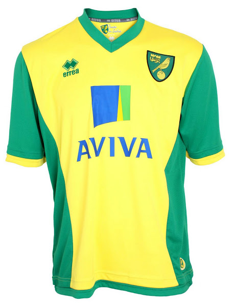
10. Norwich City
I love seeing smaller kit manufacturers in the Premier League. Nike and Adidas make some great designs, but there's usually more creativity elsewhere. Erreà gave Norwich even more color than usual this year. Unfortunately, the fabric looks slightly low-budget, but the design itself is great. In a league dominated by reds, whites, and blues, it's great to see a team wearing yellow and green. The design adds even more green than usual, and Norwich's awesome Egyptian hieroglyph-style crest is nice and big. The sponsor is a bit ugly, but I'll let it slide because the shirt is so unique.

9. Hull City
The team crest could be a little larger, and the sponsor logo could be a little less ugly, but other than that, the Tigers have a very fitting shirt. With bonus striped socks for good measure! The amber and black color scheme is magnificent. Sadly, it's yet another Adidas template you'll see time and time again with the "wings" on the sleeves, but it works well on Hull's shirt. I particularly enjoy the two-color collar that inverts the center stripe.

8. West Bromwich Albion
It was hard for me to pick between Hull and West Brom. Both clubs use the same striped Adidas template, and both have pleasant color schemes with ugly sponsors. But West Brom has a larger team crest and slightly larger stripes, which give it a bolder look. And as ugly as the big rectangular Zoopla logo is, I actually think the deep purple compliments the white/navy color scheme of the stripes. And of course, they've got the striped socks I love.

7. Crystal Palace
Crystal Palace have the same problem Norwich has. A unique color scheme with a bold design, but a small shirt manufacturer with slightly cheap-looking material. Regardless, I wish there were more teams in world soccer that wore halved shirts like this. And although it's a bit too small on the shirt, they've got a great redesigned team crest. I just wish the sponsor didn't have its URL on the shirt. Palace gets bonus points for a super classy away jersey, too--the best away jersey in the Premier League this season. Gotta love when sponsors agree to use smaller logos to let the shirt design flow.

6. Swansea City
The epitome of a template fitting a team perfectly. The team crest is a swan with black wings, and the shirt is Adidas' "winged sleeve" template for... black wings. The shirt is modern, elegant, and simple. The sponsor features virtually indecipherable letters ("GWFX") above some Chinese letters, but that's actually okay with me. The gold compliments the white & black color scheme, and is an echo to the gold trim they wore last season. It's less gaudy and noticeable when you can't even read it. The Swans are also wearing an excellently gaudy away jersey this season. It's not the fun Welsh flag away strip of last year, but it's still awesome.

5. Arsenal
Arsenal gets tons of bonus points for being the only club in the Premier League not to wear a new kit this year. Instead, they're *gasp* wearing the same kit from last year. Replica kits for fans have become a multimillion dollar industry, and it's respectable to see a team avoid going for the quick annual money grab, especially a team as popular worldwide as Arsenal. Many people might not like the blue on the sleeves, but it's a classy design. Their current crest, introduced in 2002, is starting to look very dated and early-'00s, though. It could use a simplified redesign.

4. Tottenham Hotspur
The best Tottenham design in years. A unique neckline design that avoids being gimmicky or the cliché collar added to everything to seem "retro." The stripes on the neck and the cuffs keep the design from being too simple. The Spurs crest is nice and big. The only downside of the whole thing is the giant HP logo in the wrong shade of blue. It's actually a decent logo to have for a sponsor since it's simple and doesn't feature a wordmark, but they could've easily darkened the shade of blue to make it match the rest of the shirt. This was a move clearly designed to make the sponsor more noticeable on TV. Unfortunate.

3. Everton
Tons of Everton fans are furious about the simplified logo redesign, and consider it a blasphemous change to their beloved previous crest. I think it's fine, though. It's easier to distinguish from afar, and it's not like the previous logo was their first ever logo anyway. But the outcry has been so much that the team was pressured into consulting fans on a "revised" version for next season. Anyway, I think it looks great, and the rest of the shirt is a class act. The white stripes on the sleeves are actually borrowed from Arsenal's design, but they look good. The collar is nice, and the sponsor is an elegant pair of elephants. I don't know what you'd ever want to change about this. Except maybe the crest, if you're an angry fan.

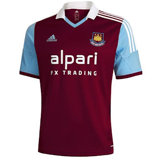
2. West Ham United
Adidas perfected the Chelsea identity with their Chelsea shirt this season, and they did the same thing with West Ham this year. Clean, classic, and avoids being boring by nature of West Ham's unique color scheme. If Aston Villa represents one polar end of the "claret shirt with blue sleeves" identity, West Ham is the other end. The design is perfect. The white collar adds a nice touch without being gimmicky. There's no way anyone could improve on this West Ham design, except to maybe get a less wordy sponsor on it.

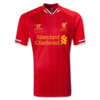
1. Liverpool
I know this will ruffle a few feathers. Liverpool's new kits have been almost universally panned, moaning about the super-'90s away and third kits. But you know what? I love them. They're very "out there," but that's what away kits and third kits are meant to do! In soccer, the home kit is the traditional one, and teams can experiment with the others. They get people talking about the team, and hey, at the end of the day the home kit is the one worn the vast majority of the time. And lost in all this discussion is the fact that the home kit this year is a work of art, and a traditional design that should please everyone. The throwback gold crest with some nice '80s striping, and subtle red-on-red pinstripe texture. Warrior, best known for its hockey gear, is making the boldest kits in soccer right now.
No comments:
Post a Comment