Showing posts sorted by date for query jersey. Sort by relevance Show all posts

Sunday, April 2, 2017

2017 MLS jersey rankings

It's been a long time since I've done this. After the dark ages of the '90s and early '00s, it seems like sports teams in general are favoring cleaner, more classic looks these days... but are they TOO classy? They're North American soccer teams, after all, not centuries-old vaunted European globetrotting franchises. Some would argue MLS clubs have gone from one extreme (take a gander at these inaugural 1996 MLS jerseys) to the other, trying too hard to feel like some established cultural pillar that they're not. You gotta keep a LITTLE fun in there, right?

But I digress. To be fair, even the weakest of these are fairly well designed, so kudos to Major League Soccer for improving over the years. Without further ado, here's my ranking of all 22 MLS primary jerseys for the 2017 season, from worst to best:

22. New England Revolution

New England is a founding member of MLS, and for its entire 21-year history, it's struggled with an awful brand identity. A terrible team name, an abysmal team logo, a bland color scheme taken straight from the New England Patriots, and a long history of ugly jerseys. The shirt sponsor United Healthcare can't seem to pick a logo either, so they've got THREE brandings on here: The UHC initials, the United Healthcare wordmark, and their logo. Can't they just pick one?

This season's look is doing the most it can with the cards it's been dealt (and minimizes the amount of gray in the shirt, which was more heavily featured in older uniforms), but I can't help but feel like this team is overdue for a total brand makeover. It's not the '90s anymore! At least the stripe down the middle of the shirt with the chevron in the negative space is unique? Maybe the only good part of this whole thing.

21. FC Dallas

In previous seasons, FC Dallas has worn some really unique red and white horizontal stripes, but they get a bit muddied up in the new shirt. What are these stripes even trying to do now? And it bothers me that they don't go all the way around the shirt--the side panels and sleeves are blank red.

The "LH" patch on the shoulder is an homage to the team's late owner Lamar Hunt, which is alright, I guess. I would normally take issue with the cheesy American flag in the bottom corner of the shirt, but it's Texas, so of course they're gonna be hyper-patriotic. I'm okay with it!

20. Sporting Kansas City

Sporting KC used to have such a good thing going, but they got usurped in the "sky blue jersey" department by New York City FC down below, and they had to add that dumb collar. It's tough to make sky blue work in a jersey, since it's such an understated color--adding those little pale blue pinstripes don't make it look any better. I'm not opposed to the concept of collars on soccer jerseys, but this isn't some Portuguese team founded in the 1800s as much as the team name would like you to think so. And the team crest is such a blahhhhh, this all just looks like a preppy polo shirt.

I lived in Kansas City for a couple years (the real one in Missouri, not the fake one in Kansas) and went to see them anytime DC United was in town--SKC has passionate fans and their stadium is top-notch... even if it's on the *~Kansas~* side.
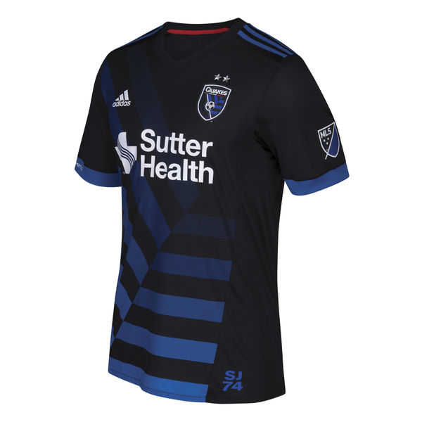
19. San Jose Earthquakes

I almost love this. This shirt isn't dead last because at least it marches to the tune of its own drum. This is almost embracing Major League Soccer's goofy '90s heritage in a way that still looks good... but it doesn't.

It stands out, but those asymmetrical gradient stripes are uuuugly. Maybe if it were a lighter shade of blue it'd look better? The team has played with shades approaching teal in the past, and those looked great. The whole shirt looks a bit too dark for a team playing in California of all places. Not to mention that in the Year of Our Lord 2017, the San Jose Earthquakes is a terrible team name that 13-year-old kids don't think is cool anymore.
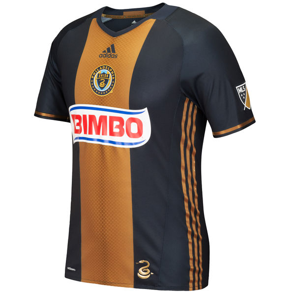
18. Philadelphia Union

The current Philly uniform sticks pretty closely to the identity they've been rocking as long as they've been in MLS, since 2010. They get points for creativity--this is a Mexican soccer-inspired look through and through, from the team crest in the center of the shirt rather than on the left breast, to the Bimbo sponsorship. I wish the Bimbo logo had colors that matched the rest of the jersey, but it's kind of charming in its Mexican soccer throwback. I know the Mexican bread brand Bimbo draws jeers in the US, but it's the world's largest baking company, so it's whateva.

My main issue with Philadelphia's look is that their color scheme just doesn't inspire much passion. The team logo with the snake is pretty great, but navy blue is tough to pull off as an interesting primary color--maybe they'd do better to include more of the gold. And the fact that the Adidas logo is also centered on the shirt gives it a bit too much of a traffic light vibe--I wish it were off to the side.

17. Orlando City

This team has SUCH a great color scheme, but they had to design the least remarkable shirt possible for it. So much wasted potential. The textured look on the solid purple jersey is nice, but I don't have any other positive words for this. Too matchy-matchy. Not enough contrast on the team crest to make it legible. Can you see the lion's head on the badge at this size? Neither can I.

Why is there an old-fashioned collar on this shirt?! It would work great for some teams, but not a two-year-old team from ORLANDO, FLORIDA. This team should have a fun, vibrant shirt! Not these authoritarian-looking gold Adidas stripes on the shoulders.

16. Chicago Fire

A plain red jersey. Not bad, not great, but it passes the test. You can see the Chicago flag embossed really faintly in the bottom corner of the shirt--but if you're gonna make it so subtle, why put it there at all?

The white stripe across the chest of the shirt sets it apart from other MLS jerseys (and they've had it since the league's inception in 1996), but is anyone really dying to wear this shirt? The sponsor, paint company Valspar, is alright but not nearly as fun as their previous shirt sponsor: oatmeal company Quaker!

15. Real Salt Lake

Real Salt Lake has a great color scheme--ironic that the colors are taken from Spanish giants Barcelona, while their name is taken from Barça's arch-rival Real Madrid--but they don't take advantage of the colors enough with this jersey. They could be incorporating the blue and the gold more, but instead, it's mostly a plain (but pleasant) red jersey.

The sponsor logo could've worked on this shirt if they made it gold, but the fact that it's white makes this yet another forgettable shirt. I wish the shade of red used for this uniform weren't so bright--in the past they've used darker maroons that feel way more classy. Last of all, what's that American flag doing in the corner? I gave Dallas the pass for this because it's Dallas, but Salt Lake City? Ehhhh...

14. Colorado Rapids

Going with the West Ham / Aston Villa style maroon shirt with sky blue sleeves--not that special in the soccer world, but it's popular because it's a great color scheme and it's unique among North American teams. PLUS it matches the colors of Colorado's other sports teams, which is a nice little bonus.

The Colorado flag on the jock tag (did you know that's what that thing is called on sports jerseys?) is a welcome addition--you know I love flags--but I wish it were incorporated in a more interesting way. This is just a "pretty decent" jersey for a "pretty decent" team.

13. Toronto FC

This is a well-designed shirt, with the nifty stripes down the sides that continue onto the sleeves and the red-on-red glossy/matte red finish on the main body of the jersey. But dark gray is too innocuous of a secondary color, and why does it have to say "The Reds" on the right sleeve cuff? If you have to proclaim your own nickname, maybe it's not as iconic a nickname as you think it is.

Not to mention the fact that Toronto's sponsor is the Bank of Montreal, the city of their arch-rivals. Whyyyy?

12. New York Red Bulls

They nearly ruined a great shirt. I've already moved on from the fact that this team is named after an energy drink--Red Bull sponsors tons of sports teams, including the much bigger Red Bull Salzburg in Austria. The Red Bull logo is actually a pretty great design element on the shirt, even if it's a bit redundant to have it on the team crest as well as on the chest as a sponsor logo. RBNY has rocked the white with red detailing well lately... until they had to ruin it with this '90s-ass red laser thing on the corner of the shirt this year.

Maybe it's really an embrace of MLS' heritage as a product of the '90s? Maybe it'll grow on me? My gut reaction is "it's terrible," though.

I've always had a tough relationship with the "names on the lower back" thing that some sports teams do, but at least it's a bit different.

11. Houston Dynamo

The solid block creamsicle primary color isn't my fave, but at least it's distinctive. The tiny little horizontal stripes do a nice job of breaking up the block of color (although I wish the stripes went all the way around the shirt), and the wide white cuffs on the sleeves help a bit too.

Somehow the Texas flag on the jock tag here doesn't bother me nearly as much as the Colorado flag on the Rapids jersey--maybe because the rest of the shirt is less busy than the Rapids shirt?

10. Columbus Crew

This is a classy-ass jersey reminiscent of Borussia Dortmund, but not so much that it feels like a ripoff. Columbus has always toyed with how much black to show on their jerseys vs. the amount of yellow, and I think they hit a good balance here--the thick black cuffs on the sleeves are key. The true highlight of this shirt, though, are those taxicab checkerboards up the sides! Unnnnffff.

Columbus gets a minus, though, for wearing yellow shorts with these yellow shirts--way too matchy-matchy, especially for such a gaudy color. They should've gone with black shorts to compliment this great yellow shirt.

9. Atlanta United

One of the two new MLS clubs this year, this is a pretty solid look overall. The red and black with gold echo the NFL's Atlanta Falcons and the NBA's Atlanta Hawks--I always give points for color scheme consistency across a city's sports teams. Atlanta seems to often pick these colors to represent the burning of the city during the Civil War. The simple, circular "A" crest is meant to evoke the city's Olympic history, hosting the Summer Games in 1996.

The vertical stripes are a good look that's unique in MLS, and the gold Adidas stripes on the shoulders are classy (although a bit too German for my tastes). The sponsor, American Family Insurance, is a bit ehhhh, but at least its logo is gold to match the rest of the shirt. Overall, a well-executed debut jersey, although nothing here really wows me.

8. Minnesota United

The second new team in the league this year, Minnesota is trying to stand out a bit. And they get a lot right: the color scheme stands alone not just among MLS clubs, but in sports in general. The crest is well-designed, the diagonal stripe is unique (the only other American team to use it is LA), and the sponsor is pretty perfect--Target is one of the most widely-recognized local Minnesota businesses, even if it makes players look kinda like walking targets.

There's just something a little off, though. Gray and light blue are great colors, but they're tough to work together. Contrast will always be an issue, and because the team crest doesn't have a black outline around it, it sort of fades into the blue stripe... you can barely even see the North Star above the main body of the logo. And unfortunately, the gray primary color just ends up looking a bit too much like a practice jersey--I'm usually all about minimalism, but maybe this shirt needs a few more details to stand out? The little collar is a nice touch, and I'd like to see more stuff like that. Overall, this look has great potential, and I'm excited to see where Minnesota's jersey designs go from here.

7. Montreal Impact

This jersey is on the verge of being a classic. I'm all about civic pride and flag incorporation, and Montreal does it right: the blue and white come from the provincial flag of Quebec, and the symbols on the jock tag come straight from the city flag of Montreal: a Fleur-de-lys for Montreal's French heritage, a rose for its English heritage, a thistle for its Scottish heritage, and a shamrock for its Irish heritage. The local Bank of Montreal sponsor is a plus as well.

I just want to see this look simplified even more: there's a bit too much extraneous piping, and the shirt has the problem many striped jerseys do, where the stripes only exist on about 60% of the shirt: they're absent from the sleeves or the back where the jersey number goes.

6. New York City FC

It's difficult to judge this jersey on its own merits, since it borrows almost entirely from its older sibling club Manchester City. It's actually a slightly better uniform than Man City's weird speed cycling look this season, but all the design elements are the same. With that said, it's a great design! Classy colors, logo, and minimalist aesthetic.

Being the Big Apple's second MLS club after the New York Red Bulls, I love how petty NYCFC are by rubbing in your face that they actually play in New York City (the Red Bulls play in New Jersey). The NYC city flag on the jock tag is a nice touch, aside from the fact that no one cares about the NYC city flag--but it's a nifty subtle touch to continue the orange from the flag onto the tiny stripes on the sleeve cuffs.


5. D.C. United

Okay, maybe I'm a little biased here. Like Columbus with their colors, DCU has always played around with how much red to show on their shirt vs. the amount of black, and usually I'm in favor of as much red as possible. But the red showing up mainly on the Adidas stripes on the sides (in addition to in the team crest) is a stroke of genius--it's enough to make me a believer in the black. The thin red/white cuffs on the sleeves and the subtle black-on-black matte/glossy striping round out the A+ look, and I love the "TAXATION WITHOUT REPRESENTATION" on the inside of the neck.

I've only got two complaints: first is the shirt sponsor, Leidos. Replacing our super classy longtime sponsor Volkswagen, Leidos is a fucking shady defense contractor, and makes me feel like I'm supporting a corporate killing machine.

My second complaint is the DC map with the DC flag in it on the jock tag. I know what you're saying... "Jake, your city pride is through the roof, you've even got the DC flag tattooed on you! You should love this!" But I think it's a little overkill in this jersey. Hear me out: the DC flag is already represented in the body of the eagle on the team logo, so it's redundant to put the flag on the jock tag as well. And I'm never a fan of "flag in a map" imagery--if the flag is supposed to represent the city, why do we also need a map of the city? Again, it's redundant. If they wanted to do a cool local touch on the bottom of the jersey, they should've just featured Taxation Without Representation more prominently--or maybe a "51" to support statehood as the 51st state?

4. Los Angeles Galaxy

This is nearly a perfect shirt. The diagonal blue and gold stripes are simple yet distinctive, and stand out among other MLS clubs. The color scheme stands on its own. The blue Adidas stripes are classy. BUT: two small things.

First, I wish the stripe went all the way up the front of the shirt. The fact that it stops at the seam around the collarbone is real weird.

Second, and more egregious: that dumb jock tag. Most people are never even going to see it. But "THIS IS LA" feels like your dad trying to be cool. "LA" already appears in big letters on the team crest. Why you gotta ruin it??

3. Seattle Sounders

Seattle's got some of the most insufferable fans, but they probably encapsulate Major League Soccer better than anyone else. Their games are packed, and they hit the perfect balance of embracing the weird '90s heritage of American soccer while keeping a clean, classy look.

That neon green that's a bit obnoxious (in a good way) and connects to Seattle's other sports teams; those blue sleeves that keep the shirt from looking boring and the team crest that's pretty close to perfect. And unmatched sponsor integration(?!?!?)--not only is Xbox a local Washington state brand, but its wordmark is simple and to the point, and the colors match perfectly! Baba booey, there's not much else you could ask for.

2. Portland Timbers

It pains me to rank Portland so high. As long as they've been in the league, they've consistently always worn some of the best jerseys in North America. The pure simplicity is staggering: a minimalist crest that doesn't even feature the team wordmark. A simple sponsor logo that matches the color of the rest of the shirt (even if it's a little strange to see Alaska advertised on a shirt for a team from Oregon). Little flourishes like the buttoned neck, the subtle green-on-green striping, and Portland city flag on the jock tag, that all make the uniform stand out without feeling too gimmicky.

This jersey is similar in many ways to Orlando's, so what makes this one so much better? I think it's a few things. The sponsor logo is incorporated way better. Orlando has a decent team crest, but it's a bit too busy for the lack of contrast in the colors, so you can't really identify it from afar while Portland's axe is identifiable immediately. Most intangibly, I think this shirt fits the quiet, wooded city of Portland better, while sunny Orlando deserves a brighter look than they get. Context matters!

1. Vancouver Whitecaps

WHAAAAAA the Pacific Northwest with a 1-2-3 knockout punch here on this list! Everything I said about Seattle mixing '90s weird North American soccer heritage with a refined modern look applies to this shirt times ten. I'm sure some people HATE the Rocko's Modern Life triangles on this jersey, but I think they're perf. Without the triangles, this is a clean, classic looking jersey with a good crest, a well-integrated sponsor logo, and a fantastic color scheme that's able to make white work as a primary color.

WITH the triangles, this is... THE RAIN JERSEY. Seriously, click that link--Vancouver made a whole video on why the triangles on the shirt represent the rain. Not many cities can own rain as a point of pride, but Vancouver makes it work. It's wonderful. The only downside of this entire jersey is that the rain triangles don't continue onto the back of the shirt.

There you have it. Tell me how 100% correct I am in the comments?!?!?

Sunday, October 6, 2013

2013-14 NHL jersey rankings

Thanks to the fun lockout last season, this is the second time I'm doing this list in 2013! There have been a few uniform changes for this season, mostly for the better. My initial thoughts on most teams' uniform sets are in the old article linked above, and this article focuses mainly on changes for the 2013-14 season. Let's take a looksie.

30. Chicago Blackhawks

Uniforms unchanged from last season. Still as culturally insensitive as ever, but people still gush over them because it's an Original Six team.

29. Anaheim Ducks

Uniforms unchanged from last season. Still too much black for a Southern California team and still too boring of a logo. Luckily the team has officially declared the "Webbed D" crest is the team's primary logo, and the wordmark appearing on their home sweater is only the secondary logo. Makes no difference for this season, but hopefully it's a hint that the vastly superior third jersey will replace the home uni next season. Apparently Anaheim will be wearing a throwback Mighty Ducks jersey for at least one game this year: the more eggplant we see, the better.

28. Columbus Blue Jackets

Uniforms unchanged from last season. There are only a few clubs still using the design relic of the '90s that is the "full sleeve shoulder yoke." It seems only a matter of time before the Blue Jackets' jackets get a facelift.

27. Florida Panthers

The blue third jersey (which I actually liked!) is retired. Still needs a better primary logo, and they still get deducted points for calling themselves "Florida" when they're not the only NHL club in Florida.

26. Winnipeg Jets

Uniforms unchanged from last season. Still as boring as ever. It's only a matter of time until a "throwback" third jersey based on the classic Winnipeg sweater is introduced, and it eventually becomes the primary jersey: just like what happened with the Oilers, Sabres and Islanders.

Tuesday, August 20, 2013

2013-14 Premier League kit rankings

It's been a few years since I did a Premier League kit ranking. With the 2013-14 season starting this past weekend, let's get started. How do you think these compare to the 2013 Major League Soccer uniforms?

20. Cardiff City

Puma continues to be the worst major kit manufacturer in soccer. A bland red shirt with the crest up way too high; it's basically on the shoulder. But by far the worst transgression of this shirt is the change in color. Cardiff have worn blue shirts for over a century. Their nickname is "the Bluebirds." But last year, new Malaysian owners of the club decided to change the primary team color to red, because red is a lucky color in East Asia, where the owners want to market the club. The bluebird crest was replaced by a red Welsh dragon crest, with the bird relegated to a small place at the bottom of the logo. I guess red is what the club needed to gain promotion to the Premier League, but it's a shame a century of history is lost in the process.

19. Southampton

Another club who changed their century-old identity to a bland red design for promotion to the Premier League. I know Southampton didn't want to become the third Premier League club with an "S" name and red/white stripes, but it's a shame they decided to forego their history in favor of a more generic all-red kit. I also dislike the monochrome crest; it can work on third kits and even away kits, but home kits are meant to have the "real" team crest in full color. Especially with such a complicated crest that's by no means iconic, all Southampton has done is make itself more anonymous. Not a bad shirt, just generic. At least they have striped socks.

18. Stoke City

Did someone say "club with an 'S' name and red/white stripes"? Stoke's newest design isn't ugly, but it's nothing new. It looks exactly like any other jersey released over the last five years. It's disrespectful to the fans to make them pay full price for a "new" kit that wouldn't have been out of place in 2008. And the Stoke crest is strangely small. It all looks very low-budget, especially compared to some of Adidas' other designs this year. They get bonus points for striped socks, though.

Monday, June 17, 2013

2013 MLS jersey rankings update: LA Galaxy third kit

This should be the final addition to my 2013 MLS jersey rankings. On Saturday, the Los Angeles Galaxy unveiled its new third kit. The internet's reaction has been very polarized. What do you think?

I guess they weren't allowed to smile for the photo shoot.

Detractors are saying it's a super ugly, clown-like color scheme. I absolutely love it. For a team with such a traditional color set otherwise, it's a nice way to jazz things up. Yes, it's a bit gaudy, but it's a third jersey. Third jerseys are meant to be experimental and weird.

The new uniforms are an homage to LA's original, gloriously hideous 1996 kits:


The homage is much more faithful than Sporting KC's new "retro" third jersey. Fashion is cyclical--are we reaching the point where over-the-top '90s designs are back in style? Liverpool, one of the biggest clubs in the world, recently unveiled an incredibly-'90s away kit as well.

Aside from being a throwback, this new LA Galaxy jersey tickles my flag-enthusiast fancy. The seemingly strange color scheme is a reference to the Los Angeles city flag:


I guess they wanted to outdo their LA rivals Chivas USA, who use the city crest on their new away jersey. If more MLS teams incorporated their city and state/provincial flags into their uniforms, I'd be a satisfied man.

Much like Sporting KC's new uniform, I like this new Galaxy kit so much I wish it would replace the comparatively boring (but still well-designed) LA away jersey.

Tuesday, June 4, 2013

Thoughts on the new Carolina Hurricanes and Dallas Stars uniforms

Carolina and Dallas both unveiled new uniforms today. My thoughts on each:

Carolina Hurricanes


It's more of a tweak than a rebranding. Both the home and away uniforms have been cleaned up and given a more "classic" look, all the rage these days across the NHL. I like it a lot, but it bears more than a passing resemblance to Hurricanes captain Eric Staal's other team, Canada--with both the white stripes on the red jersey, and the red shoulder yoke on the white jersey, with black piping around the names and numbers.

With that said, they're great. The simplified name and number font is a huge step up from the italicized "NASCAR" font they used before, and I enjoy the red shoulder yoke on the away sweater. My biggest gripe is that in the process of otherwise-smart simplification, the jerseys have lost a bit of character. I particularly miss the square hurricane warning flag pattern around the bottom of the jerseys.

The Hurricanes also announced their existing black third jersey will continue to be worn next season. It's a bummer those jerseys won't be retired, or at least cleaned up like their other jerseys were.

Dallas Stars


This is another "simplified" jersey update. Gone (for the most part) is the drab black of the last two decades, replaced by glorious green--the most under-appreciated color in sports. And luckily, it's not a super dark, almost-black green either like they've worn before; it's green green! It even carries over to a substantial amount of green on the white away jersey.

But of course, they didn't abandon black altogether. I wish instead of black detailing, they had used the gold from their previous uniforms... particularly the bright gold detailing from their time as the Minnesota North Stars. Overall, these are good sweaters but the black detailing detracts from the brightness.

I'm torn on the new logo. On one hand, it's a step up from their last logo. But I still don't think it's great. I don't know if there's any way to make a really great logo out of an unremarkable name like "the Stars."

Monday, May 27, 2013

2013 MLS jersey rankings update: Sporting KC third kit!

A quick update to my ranking of Major League Soccer's assorted club uniforms for the 2013 season: last month, Sporting Kansas City unveiled a third jersey. What do you think?


Black with an argyle light/dark blue pattern across the chest. It's apparently a reference to the team's original jerseys back in the '90s when they were known as the wonderful Kansas City Wiz, later extended to the Wizards.

The jersey is great. The design is original and striking. The sponsor logo below the argyle pattern makes the whole thing look a bit too busy, but we can't escape big ol' sponsor logos even in specialty shirts... or can we?

Scottish giants Celtic and Rangers seem to be able to convince their sponsors to minimize their logos when the clubs want to release commemorative jerseys. Celtic's new 125th anniversary kit features the Tennent's sponsor logo in small white-on-white lettering below the team crest:


Why couldn't Sporting KC convince Ivy Funds to do the same?

Anyway, the dark new third jersey is so good, I'm not sure why it's a third jersey. Really, it should replace SKC's decent-but-unremarkable current away jersey:


But the whole "acknowledging our uniforms from the '90s" thing may be a sham. I don't recall nor could I find online any evidence of 1990s argyle jerseys in Kansas City. I guess the jerseys are meant to be a reference to this beauty:


A black shirt with a wavy design on the chest. But way more groovy than Sporting KC's new third jersey.

Overall, Sporting's new kit is a great design, but it doesn't quite bump the team up in my previous jersey rankings.

Monday, April 22, 2013

Why are so many U.S. state flags terrible?

I wish I could say this is the worst flag in the country,
but two dozen other state flags give it a run for its money.

Flags are icons of whatever they represent. When you see a flag, you should immediately be able to tell what it stands for. It's strange that the United States, one of the flag-wavingest countries in the world, has so many subpar state flags.

From afar, do you have any idea which state's flag this is?
If not, it's failed as a flag.
Why? Roughly half the states in the country have adopted the "boring state seal + bland navy blue background" format for their flag. Some state flags even have the name of the state spelled out on them, defeating the entire purpose of having a flag to represent them. Think of the state with the most proud residents of all: Texas. It's one of the few states to produce a decent flag. This is no coincidence; if you care about your state, chances are you've given it a good flag.

There will always be a few exceptions, but the North American Vexillological Association defines a "good flag" by five basic principles:

  1. Keep it simple. The flag should be so simple that a child can draw it from memory.
  2. Use meaningful symbolism. The flag’s images, colors, or patterns should relate to what it symbolizes.
  3. Use two or three basic colors. Limit the number of colors on the flag to three, which contrast well and come from the standard color set.
  4. No lettering or seals. Never use writing of any kind or an organization’s seal.
  5. Be distinctive or be related. Avoid duplicating other flags, but use similarities to show connections.

Monday, March 4, 2013

2013 MLS jersey rankings

I've been on a jersey roll lately! I did a Major League Soccer jersey ranking a few years ago, but it's time for a new one, especially when everyone's jersey is lightyears ahead of where they were last time I  did this list.

The MLS season started this past weekend, so there's no better time to rank the league's uniforms for the year. MLS has acknowledged jersey enthusiasts this year, with their first-ever "Jersey Week" revealing all the new kits for the season. Adidas does a great job with its MLS uniforms, so even the "worst" jerseys on this list look great compared to many teams around the world. So let's get started!

Note: there's a new number/name font for the back of MLS jerseys this year. It's a big improvement over the last one.

19. Portland Timbers

It breaks my heart to put Portland dead last. The last two seasons they wore perhaps my all-time favorite Major League Soccer kits. It's as if they didn't really know how to improve upon perfection, so they just went for a huge downgrade.

Both their home and away jerseys look very similar to their last set, but with unnecessary changes. I guess that's the real shame of the soccer world's constant jersey turnover cycle.

Why do they need those arbitrary white stripes on the sides? Why do they need that sci-fi triangle collar thing? That Portland city flag near the waist is nice, but why does it need to be in the shape of Oregon? Isn't that a bit redundant?

18. Montréal Impact

It's a shame that a team with such an iconic French-Canadian identity to capitalize on has such a lackluster uniform for its first couple years in MLS.

Yes, they wear blue and white and they feature the fleur-de-lis everywhere, but I can't help but feel that their shirts look like practice jerseys. And really, "Montréal Impact"? I still can't get over the fact that their team name is incredibly 1990s.

But there's hope! Last week the club unveiled their new third jersey, and it's a work of art. The Inter Milan-style blue-and-black stripes are timeless. One can only hope a shirt like this eventually becomes their home jersey.

Saturday, March 2, 2013

Thoughts on the new U.S. national team uniform

Yesterday, U.S. Soccer unveiled its new "Centennial" home kit for 2013/14. A throwback to the first U.S. soccer jerseys in 1913, it's a simple white design with a retro crest:


The new kit has been universally praised by fans, and for good reason. In an age of all sorts of "technological advancements" for jerseys, this is a clean, classy design from Nike. And I don't think the centennial crest will be the new permanent team logo, but it could at least be a hint that the old ugly logo is on its way out for good.

But I'm not so happy about this jersey. First of all, it seems U.S. Soccer has finally succumbed to the Annual Jersey Cycle, releasing a new kit for fans to shell out huge amounts of money on every single year. Sigh. I guess that's modern soccer for ya.

More importantly, though, do we really want this blank white shirt to be our "look"? It doesn't stand out at all among international teams--many of whom have been around for much longer with much more celebrated histories than U.S. Soccer--and these blank white shirts don't give us any sort of identity.

U.S. Soccer has struggled with the Generic White Shirt look for a long time, but they seemed to finally figure it out last year when they unveiled a beautiful red and white striped shirt with blue shorts (pictured on right). The hoops looked great and gave us a real identity we didn't have before.

But of course, fans are always afraid of change, and many refer to it disparagingly as the "Where's Waldo" jersey. They were all ecstatic to see a return to vanilla with the centennial jersey.

It's a shame. I was hoping the Where's Waldo jersey could turn into a permanent identity for U.S. Soccer as our national team slowly becomes a real player on the world stage. If we're lucky, U.S. Soccer will return to the red/white horizontal striped look for the World Cup next year in Brazil. If we're lucky.

Wednesday, February 6, 2013

2013 NHL jersey rankings

I wrote about changes in hockey jerseys this year, but I've never done a full NHL ranking of team sweaters. With a return to clean, classic looks being the new trend in jersey design, the NHL is looking better than ever 2013. This season is the most stagnant in a long time, uniform-wise, so it's the perfect opportunity to start my list. Without further ado:

30. Chicago Blackhawks

Hardcore hockey fans are always partial towards the sweaters of Original Six teams, and many folks in the hockey community point to this jersey in particular as the pinnacle of jersey aesthetics. I think it's absolutely atrocious. It's a boring sweater with no clear color scheme and an even more boring away jersey. But more importantly, it's racist. Defenders of the Blackhawks will say it's not nearly as incendiary as other Native American-named sports teams, like the Cleveland Indians and Washington Redskins. They even say it's "respectful." But how would you feel if there were a team called the Chicago Zulus, with a "respectful" cartoon tribal leader as its primary logo? In the 21st century, it's unacceptable. And unlike some other Native American-named teams, the Blackhawks have an easy way out: they could change the logo without changing the name, and "Blackhawks" could literally refer to birds rather than to an ethnic group of humans.

29. Anaheim Ducks

Chicago racism aside, this is by far the ugliest jersey in hockey and Anaheim knows it. They take every chance they can get to wear their slightly more colorful third jersey, and I wouldn't be surprised to see the third jersey become the new home jersey in a couple years. Even when I went to the Ducks home opener this year, more fans at Honda Center were wearing the third jersey than the home one. The home jersey has no personality, and the boring wordmark is too small to read from far away.
It frustrates me that all three California NHL teams feature predominantly black jerseys. Of all places to not wear black, you'd think it'd be California. The Ducks wear orange as a reference to Orange County where they play, which I'd like to see more of. And with the shoulder patch on their third jersey, they're even beginning to hint at their classic Mighty Ducks look. Perhaps it's a sign of things to come.

Saturday, January 26, 2013

A Capitals Fan in Anaheim

Ducks forward Matt Beleskey punches himself in the head

I went to my first non-Washington Capitals NHL game last night. My parents live in San Diego now, so the Anaheim Ducks are the closest thing they have to a local team. Austin and I drove up Interstate 5 for their home opener against the Vancouver Canucks. What followed was a hilarious 5-0 rout by Vancouver that featured not one, but three fights.

The first thing we noticed upon reaching the Ducks' home arena of Honda Center was how classy and modern it is. The jumbotron may not be as great as Verizon Center's HD wonder in DC, but the concourses look like an upscale hotel. I was amazed to discover when Wikiing the arena afterwards that it's actually twenty years old. I also discovered its first-ever event was a Barry Manilow concert--that's a little embarrassing. Interesting that the exterior of Honda Center still retains a very teal color scheme, reminiscent of the team's days as the Mighty Ducks of Anaheim.

Speaking of the Mighty Ducks, I was a little bummed out by the lack of classic Mighty Ducks jerseys in the crowd. There were a handful, but the bulk of fans at the game were wearing their current boring black sweater. The team seems to know it's boring, since they handed out glowing orange styrofoam sticks to make the stands look more colorful. They realize that while an arena full of fans wearing a bright color looks awesome, an arena full of fans wearing black makes the place look empty. So they handed out these bright orange sticks for people to wave around to make the crowd look lively on TV. The fans were loud, but as a Caps fan, I was a little disappointed compared to crowd volume levels at Verizon Center back home. True, their team got spanked, but even when it was close in the first period, the energy level didn't quite measure up to DC.

Friday, January 18, 2013

2013 in hockey jerseys

Anyone who knows me knows I'm a bit of a jersey enthusiast. Heck, despite all my videogame journalism, four of my five most-read articles of all time are all about jerseys (and the other is about a team logo).

I cannot deny my love for hockey uniforms, and the NHL season starts tomorrow! The new season is the most stagnant in recent memory when it comes to new get-ups. So all we can do now is speculate about the future. For reference, my two go-to websites for everything related to hockey sweaters are Icethetics and the NHL Uniform Database.

Dallas Stars reboot


The most drastic overhaul is coming next season in 2013-14 when the Dallas Stars will redo their entire look. Their current sweaters are unremarkable, a product of the Edgy Black Jerseys fad of the 1990s. But with the revamp, the predominant color will be green--the most underappreciated color in the NHL, only appearing today in the Minnesota Wild's third jersey.

Wednesday, August 25, 2010

Ranking Premier League kits

I've been waiting to do this for a long time, but I wanted to wait until the season started so we could see all the new kits. Here we go.

NOTE: Some people can't seem to figure it out, but the phrases in parentheses are in fact hyperlinks to teams' away and third kits, which are not pictured in this article.

20. Bolton Wanderers (blue away kit & navy third kit)

It's a step up from last year's strange-striped catastrophe, but Bolton's kits are still the worst in the league. Shady online gambling sites are all over European soccer jerseys today, but that doesn't make them any less horrendous. I respect that this is the only EPL kit currently made by Reebok, a company which happens to be from Bolton, but that doesn't excuse the giant Reebok logos on the shoulders (and shorts). For the most part, this is a soulless kit devoured by a betting site sponsor that doesn't even change its orange & gray color scheme to match the rest of the kit's white, blue & red scheme.

19. Blackpool (white away kit & blue third kit)

I appreciate kits that are made by companies other than Adidas, Nike, and Puma, but this Carbrini design is lacking. Once again, a gaudy sponsor with a color scheme that doesn't match the rest of the kit pukes all over this shirt. The shade of tangerine is a bit off, too. Blackpool has a great crest, but you can hardly distinguish it in this jersey. I'll cut them a bit of slack, though, since this is their first season ever in the Premier League.

18. Wigan Athletic (black away kit)

Another "good smaller manufacturer (Mi-Fit) but nevertheless a bad design" situation. Wigan is Mi-Fit's hometown team, which is nice. Most English clubs have a traditional, century-old design for their home shirt and are more adventurous with their away and third kits--a winning combination. But Wigan can't seem to decide what its "look" is, even for home kits. "I guess it's blue, with some white" is as specific as their identity gets. And the 188Bet sponsor is the same vomit that appears on Bolton's travesty of a shirt.

17. West Bromwich Albion (black away kit & red third kit)

Umbro is by far my favorite kit manufacturer. Clean, classic shirts. West Brom's shirts are fantastic. Great striping, a retro collar, and a striking black & white crest on the jet black away kit. So why is this uniform all the way down at #17? The sponsor. This is the worst ruining of a shirt by a sponsor in the entire league. Not only do the colors not work, but it's huge and obtrusive. I'm sure WBA management didn't enjoy not having a sponsor last season, but it meant their kits were vastly superior. Maybe this sponsor is going with the "it's so ugly they'll remember us" line of thinking.

16. Birmingham City (white away kit & red third kit)

Finally, a team with a well-integrated sponsor. The color scheme fits, and I've always thought the duality of the big F & C matches Birmingham's dual circle logo. Chinese manufacturer Xtep's big chevron design on the chest is pretty unique, but it still doesn't match the club's old Umbro designs. Otherwise, this is a pretty routine design with routine colors that don't stand out very much. Perhaps the fairly unremarkable uniform matches the fairly unremarkable club who wears it.

15. Newcastle United (blue away kit & white third kit)

Puma is the laziest of kit manufacturers. Newcastle's home strip is decent, but the club's classic black & white stripe pattern works despite Puma's design template, rather than because of it. Other than the home shirt, Puma completely phones it in with the away and third kits, which are variations of Italy World Cup jersey clones (and after Italy's World Cup, I don't know if teams want to draw that comparison). You'll notice this throughout the list with every single Puma creation. That irregular collar was nifty the first time we saw it, but not after 500 shirts with that collar.

14. Wolverhampton Wanderers (black away kit)

It's a shame the blue & red "sportingbet" sponsor colors ruin this one, because otherwise this Burrda kits stands out as a smart design. The shade of yellow/orange is unique and works well against the black details, and the collar is one-of-a-kind among Premier League teams. If the sponsor would change its colors, this shirt would definitely make the top ten--orange is harder to pull off than most other colors in clothing. And Wolves have a very un-English abstract wolf logo I highly enjoy--one that made a cameo in The Elder Scrolls IV: Oblivion. If the club avoids relegation, I look forward to what they've got next year.

13. Fulham (red away kit & green third kit)

Kappa's design for Fulham would be spectacular if it weren't for the horrendous sponsor. I sense this "sponsor ruining a shirt" theme keeps reappearing... perhaps clubs should take notice. Anyway, "FxPro" wouldn't be nearly so bad if it didn't feature the "Trade Forex like a pro!" subtitle underneath it. Fulham has also got the most boring crest in all of England. But the shirt itself is sharply designed, and the away and third kits are real head-turners. If only FxPro could clean itself up, these would be A+ kits.

12. Stoke City (blue away kit)

Stoke City's kits have no real issues, per se. The sponsor looks fine, the crest looks fine, the design is smart, there's no problem. But it's just so regular that it becomes incredibly boring. The Adidas template reminds me of MLS uniforms, but in a league with far more tradition and variation, you'd think Stoke could come up with something more creative. Their kits will always be compared to Sunderland's, both because they're "red & white stripes" and because alphabetically, Stoke and Sunderland are even right next to each other. Sunderland has really outdone itself this year, and Stoke stutters in comparison.

11. Aston Villa (black away kit & white third kit)

Fulham's horrendous "FxPro: Trade Forex Like a Pro!" sponsor reappears in Aston Villa's kit, but it looks a bit better here... at least in the home kit, where the colors have been changed to match Villa's iconic claret & blue. On the other two shirts, it's just a gaudy red. When will sponsors learn? Anyway, the checkerboard trim down the sides is a nice touch, and Villa always have their sweet crest ("PREPARED!"). But even if it's not as ugly as on the Fulham shirt, the FxPro sponsor definitely downgrades the whole kit a notch.

10. Tottenham Hotspur (blue away kit, navy third kit, white cup kit)

I already reviewed these kits in one of my first-ever blog posts. Well, the home shirt is classy, and the new sponsor looks fine (the sponsor on the cup kit may even look better), but as I mentioned with Newcastle, Puma is a lazy manufacturer. Other than the home kit--which has fantastic shorts, by the way--Puma really couldn't care less about the Uruguay-crossed-with-Italy away kit. The navy third kit isn't great, but I appreciate the lime green trim; this should be the away kit. But I always thought, "at least the home shirt is original"... until Tottenham played Swiss club BSC Young Boys in Champions League, and I looked up Young Boys' Puma away kit. Ugh. I'll be glad to see Spurs switch to Adidas next season.

9. West Ham United (white away kit)

Like Stoke being compared to Sunderland, West Ham's kit will always be compared to Aston Villa's. And the Hammers have a smart retro outfit this year, an improvement over last season's. Small manufacturer Macron, throwback trimmings, a superior away kit, and the badass castle-and-hammers logo have even pushed West Ham above Aston Villa on my list, which seems like blasphemy. Hopefully this forces Villa to push the envelope next season.

8. Blackburn Rovers (red away kit & white third kit)

The ugly black rectangle around the Crown Paints sponsor (which is much better integrated on Blackburn's away and third shirts) is really the only reason this is down at #8 on the list. I understand it's tough to think of a way to make the sponsor look good on two different colors at once, but come on. Umbro once again produce a sleek, simple uniform, and I'm a sucker for Blackburn's halved shirts; I wish we'd see more teams with halves like this. A neat retro collar and a crest which adds a subtle red detailing to the shirt carries over to the away and third shirts, which all work very well together as a coherent set of uniforms.

7. Everton (pink away kit)

A lot of people are going to disagree with my placement of Everton's Le Coq Sportif kits so high on the list. They all hate the hot pink away shirt. But I think it's the greatest decision the club could have made. Like I said before, home shirts are meant to be traditional, and Everton's all-blue definitely does the job in that department with a smart, clean design and an awesome sponsor. Away kits are meant to be a club's chance to experiment. The hot pink is eye-catching, a color you hardly see at all in professional sports. French manufacturer Le Coq (the most suggestive, most French company name of all time) outdid themselves, especially compared to last season's abysmal "V" shirts.

6. Liverpool (white away kit & black third kit)

It's a shame Liverpool had to part with their righteous long-term sponsor Carlsberg, but the new sponsor isn't horrible. And the shirt itself is better; look at the subtle diamond pattern throughout the shirt. The smart design is definitely reminiscent of Adidas' great MLS kits, with one big difference: Liverpool's away and third shirts are awesome. You'll also notice despite my constantly saying "I appreciate small manufacturers," most of the kits near the top of this list are from major companies. I guess the big guys have the money to create the smarter designs with better materials.

5. Chelsea (black away kit & green third kit)

Some fans feel iffy about Chelsea adding a little red trim to their mostly blue kit... oh no, not red! But it's a nice touch. And overall, once again Adidas delivers a solid kit with a fine sponsor. There's not really anything else one could ask for in a Chelsea home kit. The away strip is modern and Tron-like, with details I like to call Neon Orange Pinstripes of the Future. When I saw the "macaw and navy" third kit, the first thing that came to mind for me was actually Scottish club Hibernian's away shirt. But Chelsea's third has a nifty blue stripe down the middle, I guess to retain the Chelsea-ness of it all.

4. Manchester United (white away kit & black third kit)

After Man U's former sponsor, AIG, happened to go down the drain, they scrambled to find a new one, and Aon looks even better. I feel a bit dirty the Big Four clubs are all so high up on my list, but much like the biggest manufacturers, the biggest clubs are going to sell the most kits around the world, so I suppose they put much more stock into having a solid look. Nike's new kit with the old-style collar is very '70s and about as sleek as they come. This is the ultimate Man U kit. It's as if Nike's actually learned something from my beloved Umbro (who they bought out in 2008), and hopefully this carries over to more Nike kits in the next few years.

3. Sunderland (cream away kit)

Huh? Sunderland? Well, it's an impeccable Umbro design with a well-integrated sponsor and a clean striped look. Normally I'd say Stoke has the edge over Sunderland, since Stoke wears simple white shorts that are coherent with their look, while Sunderland adds the unnecessary third color of black. But it looks fantastic here, and as you can see, Sunderland has spanked their fellow red & white striped rivals this year. And I love that the away kit isn't quite white; it's more of a cream off-white, which looks excellent with the maroon detailing and matching sponsor colors to boot!

2. Arsenal (yellow away kit & blue third kit)

As a Tottenham supporter, it kills me to say this, but Arsenal have majestic uniforms. After last season's disappointing shirts, this year Nike has again taken a cue from Umbro and created an ageless uniform. If I were a Gunners fan, I'd just be bummed out soccer works on this "new jerseys every season" format, because almost by default, anything other than this shirt next year will be a downgrade. The simple red with white sleeves, the fantastic cuffs at the ends of the sleeves, the A+ sponsor... it's virtually perfect. The away kit is beautiful as well, with this same basic template applied to a unique yellow & maroon color scheme.

1. Manchester City (blue away kit & white third kit)

Delicious. The epitome of the classic Umbro design, unique colors, a great sponsor, an iconic crest. I'm incredibly jealous of Man City fans. I love the subtle same-color stripes on the shirt, as well as the retro cuffs on the sleeves. I suggest clicking on the jersey to my right so you can get a bigger view of the most gorgeous shirt in English soccer. With Etihad Airways on this shirt and Emirates on the Arsenal shirt, I guess the lesson is: "Get an airline from the United Arab Emirates to be your sponsor." The dark blue away kit is equally classy, and features spectacular hooped socks. The nifty "T" collar design, along with its color scheme, reminds me of Dark Samus from the Metroid Prime video game series of all things. The third shirt with the sash provides a nice completely different take on the Man City identity. I love that on this shirt, the sponsor was even willing to make their logo smaller to better accommodate the design. These are the best kits in England.